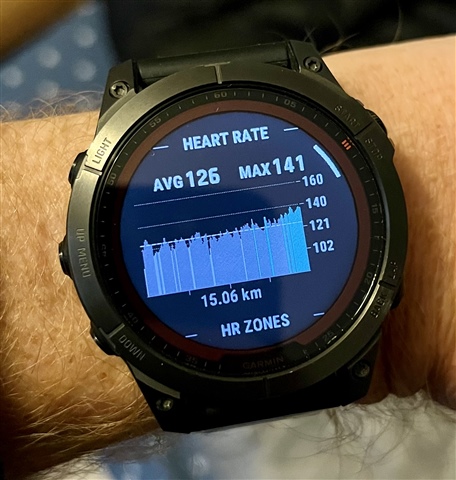
Anyone else seeing problems with the colouring of the heart rate graph that shows on the watch after an activity?
I think the colours are all one HR zone lower than what they’re supposed to be. See pics - most of run is in blue zone going green at the end, but on the graph it’s mostly grey then goes blue at the end.
My zones are set by LTHR - I wonder if the graph is using MaxHR zones to decide colours? Not sure how to test that hypothesis.