
I noticed that the colors of the HR zones in the post-activity report differs from the HR zones I defined for the sport (in this example running): here you can see that I spent almost all the time at my defined zone 2 (blue) with almost 0% at my defined zone 3 (green), but the graph tells another story, with around 40% of the time at zone 3 (green).
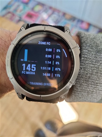
This has an impact on the workout training effect: the load is higher then expected and the the workout was labeled as "Tempo" instead of "Base".
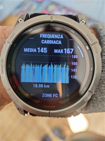
I did some testing during another activity (indoor cycling), using a page with HR graph as single field, and I discovered that the colors do not match my defined HR zones even during activity in this graph.
Finally I found that this during-activity graph, the post-activity graph and all the training effect related-things calculated for the workout are made using the "generic" HR zones and not the sport-specific HR zones.
fēnix® 7X – Sapphire Solar Edition
Software version 7.24

