Anyone notice that major roads on V 8.80 maps look like rivers and canals. Almost the same colour of blue as the water. Why not another colour? They just look like rivers or canals.
Anyone notice that major roads on V 8.80 maps look like rivers and canals. Almost the same colour of blue as the water. Why not another colour? They just look like rivers or canals.
It looks like the major roads now use a similar color as Google Maps does. For me it is different enough from water, which is more blue. It took me some getting used to but I find the new color scheme actually more clear now (for TopoActive maps).
Why not in grey blue instead of blue
Concerning small ways in red it is very nice
I don’t remember exactly what they were before, but now they are wider and almost the same blue as water, they look like rivers or canals where I live. Honestly you wait forever for a software update and then you’ve got to wonder if they even tested or looked at what they did before they release it.
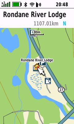
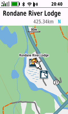
One additional change is how the POI icons are now displayed, the icons have become bigger but too big imho. Compare these two screenshots, one without the new map theme file, the other with the new map theme file. Both on device software version 8.80.
Without new map theme:

With new map theme:

Yes they are way too big, and you can’t turn any of them off individually, it ridiculous to have so many POIs cluttering up the map, they should be categorized somehow. Your highway 27 actually looks green, mine are more blue.
Resurrecting an old thread. With the TopoActive 2025.10 maps and the updated map theme files (SID files), the POI icons are now smaller (seems even smaller than before the map theme changes). Also way less POIs seem to be present than with previous TopoActive map versions.