This discussion has been locked.
You can no longer post new replies to this discussion. If you have a question you can start a new discussion

New Chart Colours are Terrible!

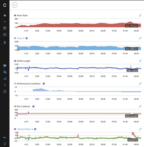
The new chart colours in the latest website update are terrible! Washed out and difficult to read black numbers on red in the HR chart. Cadence chart isn't much better!

Why!! There was nothing wrong with the previous colours! This is Change for Change Sake! And yet again, makes it worse!!

Top Replies

All Replies

  • Thank you for the feedback,  . I'd like to make sure it can be considered for possible future changes. Please submit it here so it gets to the right folks to review: https://garmin.com/ideas

  • It’s not an idea! It’s a mess! The colours are bad but the horizontal numbers are in the graph for strength and cycling! They are below the graph in running and walking! It’s a bug! It’s not been tested yet again! Just pushed out as usual!

  • Goes from bad to worse! New update now puts the font in the graph for all activities! Now near impossible to see! The anatomy figure in strength activity’s is so washed out you can hardly see it! It was perfectly fine before, all these pointless changes for the worse. The site is slowly becoming unusable!

  • The anatomy figure in strength activity’s is so washed out you can hardly see it! It was perfectly fine before

    Personally, I see no big difference, and the silhouette is still visible perfectly. Isn't the contrast or gamma on your monitor set to an extreme value?