This discussion has been locked.
You can no longer post new replies to this discussion. If you have a question you can start a new discussion

Dropdown fields display issue

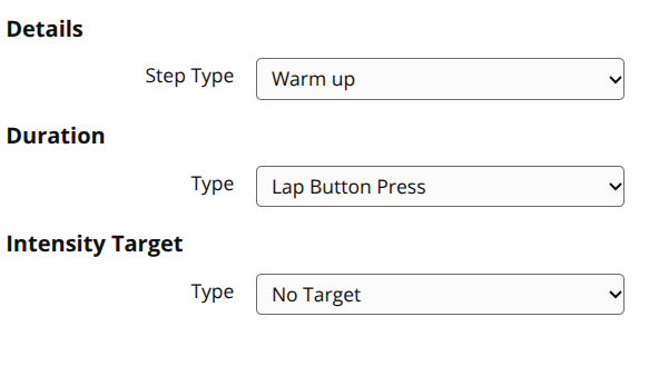
The drop-down fields in the web version of Garmin Connect are displaying incorrectly. I think it's a recent change?

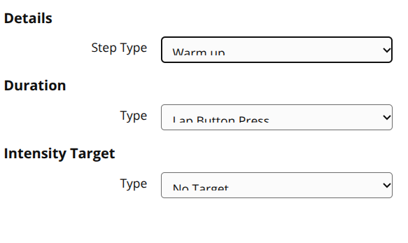
The problem seems to be with the CSS.

.GarminInputWrapper_garminInputWrapper__9xpbj select has padding of 8px. Removing that fixes it.

  • I’ve noticed this as well. As you noted, this appears to be a Chromium-specific CSS regression in Garmin’s frontend, while Firefox works perfectly. I submitted a support case through Garmin’s email option, which usually takes a few days for a response - https://support.garmin.com

  • I understand that thorough testing is necessary to ensure changes don't cause unintended consequences (especially with Garmin's track record), but it's baffling that a simple line of CSS code can't be fixed in a week, especially after reaching out to support and reproducing the issue with them.

  • After three days, I got an initial email from Garmin Product Support on January 23, asking for screenshots to describe the issue. Today, January 26, I received another email:

    Thank you very much for the image. I have created a ticket to have our Garmin Connect app/web helpdesk team member to review and work on the fix. We greatly appreciate your feedback on this as this has helped improved customer facing views for our Garmin Connect web.

  • That's interesting. After my live chat with support, I didn't get any follow-up. I provided screenshots and they could replicate the issue, so maybe that's why. Hopefully, this bug gets fixed soon. It's not a big deal, but it's annoying!

  • This appears to be working correctly now. 

    Yesterday:

    Today:

  • Excellent. That didn't take long to fix.