Feature request: Activity List - user should be able to instantly jump to any point in the list; currently it takes forever to scroll through large amount of activities

What do I mean by this?

Like most "infinitely scrolling" apps/sites, the Connect website's activity list only loads/shows a handful of items at a time, for performance reasons. This is also known as "lazy loading".

The problem is that for lazy loaded lists like this, the scrollbar typically only reflects your position in the currently loaded items. When you scroll to the bottom of the currently loaded items, more items are loaded.

The downside to this approach is that if you have lots of activities (like 5-10 years worth), and you want to jump to an arbitrary point in the list (like the middle), you have to scroll for a *long* time. (Scroll to bottom, wait for more items to load, scroll to bottom, wait for more items to load, etc.)

For example, I have data in Connect going back to 2013 :/. In the list of all activities in the Connect website, there's no easy way to jump to -- say -- May 2019, unless I feel like scrolling for a real long time. In practice, I would probably filter by date or use a different site to access the data.

Of course I will anticipate the objection that this is just how infinite scrolling works. Yes, it is - by default. It works especially well for social media sites which are very well suited to infinite scrolling (because you're scrolling through a timeline or a list of algorithmically recommended posts). In those cases, you usually don't really have a need to jump to some arbitrary point in the list. (In the case of a timeline on *social media*, typically nobody cares about anything except the most recent posts. In the case of algorithmic recommendations, you usually want the first result you haven't looked at yet.)

But there are many examples of apps and sites with infinite scrolling / lazy loading where there is a custom scrollbar/scrubber which allows you to instantly jump to any point in the list, because in these lists, it actually does make sense to quickly go further down the list. As a bonus, the scrubber usually displays some kind of hint to where you are in the list (e.g. for a time-oriented list, it might show the month and year of your current position in the list, or for a list of artists in a music app, it might show the first letter of the artist).

Some examples:

- Spotify app > Your Library tab. This list is clearly lazy loaded, because if you grab the custom scrubber and scroll quickly you will see placeholders for the artist/playlist images which are loaded on demand. But you will also see that the scrubber allows you to instantly jump to any point in the list, no matter how long it is. And the scrubber displays the month and year of your current position in the list

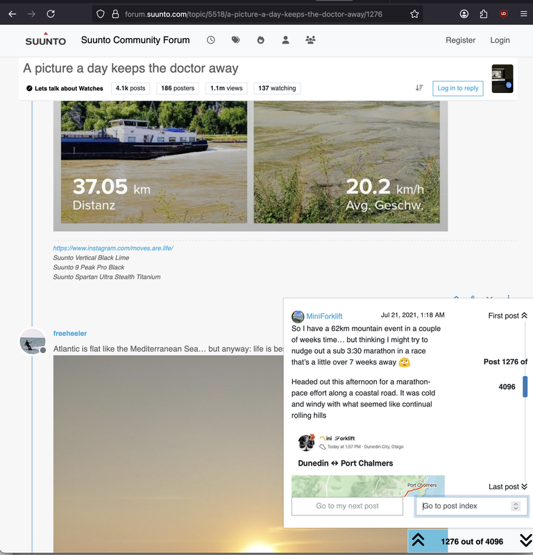
- nodebb forum platform. For forums that use nodebb and which have infinite scrolling enabled, there's a custom control with its own scrollbar that lets you jump to any post in a long thread, instantly, even though not all the posts are loaded at once. This works in both mobile and desktop btw

e.g. This topic on the suunto forums has 4k comments, and it's possible to scroll to any point in the entire topic instantly, using the custom control:

https://forum.suunto.com/topic/5518/a-picture-a-day-keeps-the-doctor-away 

- Strava app - Training Log

The native scrollbar scrolls through the entire list, whose contents are lazy loaded (you can see them loading as you scroll). If you tap on the calendar icon, you get a sidebar which allows you to instantly scroll to specific months/years (as well as races)

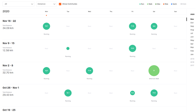
- Stryd app - Calendar

This is an infinite scrolling list of recorded activities, ordered by date. It has no native scrollbar, but if you tap the calendar icon, it opens a sheet where you can fairly quickly scroll to any given date in your history (it also has a graphical indication of which dates actually have activities)

--

Those are just some examples of apps/sites which:

- have long lists of data which are lazy loaded / use infinite scroll

- also have a way to navigate through these long lists very quickly / somewhat precisely (e.g. in the Spotify app, I can easily jump to any month/year of my library)

--

Yeah, I know the Connect website's activity list has worked this way since the redesign years ago, when the list was changed to infinite scroll. Yeah, I know this feature request will never be implemented. Tbh I barely use the Connect website anyway. I'm sure the majority of Garmin users either use the Connect app or Strava. (I know lots of people who never open Connect)

--

Also, the calendar in both the Connect app and Connect website has a similar problem - it is fairly slow to jump to a specific month/year. You have to keep pressing the back/forward button, and each time you do so, you have wait a little bit for the previous/next month/year to load.

Similarly, it's not convenient to jump to an arbitrary point in the Connect app activity list. This list isn't "infinite", but it has 7d, 4w and 1y views. (The 1y view is grouped by month)

If I want to jump to May 2019 of my running activities in the app, I have to select all running activities > 1y and tap the back button a few times before finally reaching 2019. Yeah, this isn't nearly as bad the Connect website, but it's still slower and more annoying than it should be, because the back/forward buttons don't respond instantly, but there's a delay as the data loads.

I can anticipate another objection: old data doesn't matter. Maybe it doesn't, but Connect makes it available, so it would be nice if it was easily accessible.

Honestly, pretty much everything in Connect that's loaded on demand has this kind of an issue. Loading of a single activity is slow, loading "real-time" device settings is slow (even DCR mentioned this), and navigating through any kind of chronological list is slow.

  • It has never occurred to me to search like that. I use the Web version, select the type of activity I'm interested in and then the Advanced button to bring up the filter box. I guess I'd be happy with a similar option on the App version. 

  • > I use the Web version, select the type of activity I'm interested in and then the Advanced button to bring up the filter box.

    Yes, as I said, that is the workaround that I use. But it is only a workaround. There are obvious limitations / annoyances, such as:

    - you have to tediously type in / select the date range

    - once you filter by that date range, you can't scroll to nearby activities before / after that range. Yes ofc you can adjust the range. but again that's tedious

    Honestly, a lot of the time I just use a different site to look at my data, where there's more efficient ways to navigate through long lists.

    > It has never occurred to me to search like that. 

    It's not exactly "searching". It's jumping to an arbitrary point in a long list. In a nutshell I am only asking for the activity list's native scrollbar to work properly, or for Garmin to implement a custom scrollbar/scrubber which does work properly. (Just like the example of the 4000-comment topic in the Suunto forums.)

    People have been using scrollbars to do this on computers for a long time, and more recently, we have also used scrubbers/custom controls to do this, for lists which have infinite scroll / lazy loading. As an analogy, when you watch a show on Netflix or listen to a song on Spotify, the scrubber control lets you jump to any point in the show or song - we don't call that "searching".

    See the thing is that even though it's called "infinite scrolling", your list of activities isn't actually infinite. If Garmin wanted to, they could provide a scrollbar or scrollbar-ish control that could let you jump to any point in the list. But they don't want to.

    Again I will point out that Strava, Spotify and other apps/sites implement the kind of thing I'm requesting, for long lists. I can quickly jump to any point in my Spotify library just by grabbing the scrubber control and sliding it vertically (just like a scrollbar). And the scrubber has a little tooltip next to it which shows the month and year of the current position. I can jump to any point in my Strava training log very quickly. So it's not exactly unheard of.

    Either way, like I said, everything to do with loading data in Connect is slow. I hate using the Connect app and seeing the running man animation a ton of times. You don't just see when you finally get to your destination (like a specific activity), you also see it when you're *navigating* to your destination (e.g. paging through the calendar or the activity list periods in the app).

    Implementing this kind of thing (quick navigation using a scrubber or some other method) for *any* long list in Connect (either the app or website) would definitely improve the user experience, but Garmin will never do it. Similarly, they will never work on eliminating the running man animation for almost every screen in the Connect app. Because:

    - they are not good at UX (and they don't care to improve)

    - they know that most of their users don't even realize the user experience could be so much better. Like you said, it never occurred to you to "search like that".

    But then again, I know so many people who never even open Connect, because it sucks.

    > I guess I'd be happy with a similar option on the App version

    Well, there's another issue. The Connect site has basic functionality not found in the app and vice versa. You can't even literally search for activities in the app. This seems like a glaring omission, especially since Garmin knows that the people who regularly use the app don't use the site, and vice versa.

    Garmin just doesn't care. I realize "fixing" all this stuff takes time and resources, but somehow other companies like Strava seem to find the time to do it. Strava doesn't have identical functionality in the site and app (the site has a few exclusive features), but at least both the site and the app let you search for activities (e.g. by name)

    And hey, it's working for them. Nobody buys a Garmin watch because the user experience in Connect is amazing. Again, lots of runners wear a Garmin but never open Connect, and use Strava for everything.

    It's just disappointing because I wish Garmin would be better, but they never will be. I don't even care if they follow the latest UI trends or not, i just want something that is efficient and usable, but instead we have Connect. Look at all the threads from people who can't see all their courses in the Connect website, because the course page auto-filters their courses by the position and zoom level of the map. In some cases your only choice to see all your courses is to *manually* change the position and zoom of the map. I won't go into the numerous UX fails here, but I will say that Strava does this much more intelligently - they have a separate page for the user's courses - apart from the course map page - and the user's courses page always shows *all* of their courses.

    Similarly, Garmin's gear selection process sucks in several ways, but somehow Strava managed to be better.

    So I don't think any of these issues are impossible to fix, since other companies are somehow able to do better.

    Same as other companies are able to use a more modern forum platform (nodebb) that works well on mobile and doesn't have all the issues that this one has (like blocking us from posting scary content like parentheses and numbers, being terrible on mobile and preventing users from quoting emojis, because the forum platform is so old that it has its own broken emoji implementation rather than relying on OS support, which has existed since 2009 or so).

  • A visual example from the 4000-comment thread in the Suunto forums:

    The popover in the lower right - which opens when you click on the little horizontal scrubber in the bottom - lets you scroll through all 4096 posts very quickly, with a preview of the post you're scrolled to, and the ability to jump to an exact post number by typing it in.

    On mobile, you can swipe the scrubber to do the same thing.

    The point is not to say that Garmin should do the exact same thing for the activity list, only to demonstrate that such a thing is possible at all.

    Without that scrubber, in order to go to any arbitrary point in the 4096 comments, you might have to scroll for a *long* time, because only a handful of comments would ever be loaded/displayed at once.

    More relevant to this exact topic:

    - training log on the strava website:

    Note the links on the right hand side that let you instantly jump to arbitrary years/months in the log. They also show any races you've run during a given year, since those might especially be of interest.

    The training log on the Strava mobile app is similar, except the years/months navigation element is hidden until you press a button (to save space).

  • I will also point out that when we wish to "scroll" like this, we're not always trying to target an exact point in the list - sometimes we just want to ballpark it (like "roughly 2/3rds down", the "middle", or the "bottom" / end). In that case, the searching analogy / workaround breaks down. (Ofc I am aware that if you want to see the "bottom" of the activity list - i.e the oldest activity - the workaround is to sort by date: oldest to newest. Once again this is an imperfect workaround because you cannot sort the list of all activities, you have to filter by an activity type first. This is also a pretty dumb limitation tbh)

    It's really just scrolling (with a scrollbar), except within the context of an entire big list, and not just the part of the list that's currently loaded.

    It's the same way we have always been able to scroll through lists which are *not* lazily loaded / infinitely scrolled.

    Ofc sometimes it's even more user-friendly than a simple scrollbar, as we can see with some of the examples.

  • Finally, here is an example of how this can be done with AG Grid, a very popular data grid for websites / web apps.

    Example of good infinite scrolling (user can scroll anywhere in the list real quick)

    https://5qkhqw.csb.app/ 

    The example grid shows a table of 8618 Olympic winners, which are lazily loaded with "infinite scrolling". (Only 100 rows are loaded at a time).

    Here's a video. Notice how I start at the top the of the list, then jump to the middle of the list, and finally jump to the bottom, in a couple of seconds. 

    As I scroll through the list:

    - rows are loaded on demand

    - the scrollbar reflects the current position in the entire list, not in the currently loaded/visible rows. [this is the key thing that's missing with the Connect website activity list]

    - if I move the scrollbar to the bottom (for example), the current position instantly jumps to the bottom of the list. Same goes for moving the scrollbar to any point in the list, like the top or the middle. The only thing I have to wait for is for the items at that position in the list to load. The scrolling itself only takes a second.

    Contrast with the Connect website's activity list: if I had to scroll to the middle, bottom or any arbitrary point in a list of 100s or 1000s of activities, I would be scrolling for a long time. To record the same kind of video with the Connect activity list would take a few minutes at least.

    Note that my demo is much faster than the Connect activity list not just because it's easier to scroll, but because when the user scrolls from point A to point B, they don't have to wait for all the data in between A and B to load, like they would with Garmin. This is the same issue that we see when paging between calendar periods in the Connect website/app or activity periods in the app - just to navigate from A to B, you have to waste time waiting for everything between A and B to load even though you don't care about that stuff.

    What I'm asking for can be done and has been done many times and in many ways. It's a way to make navigating long lists much more user friendly. I will admit lots of sites and apps absolutely do *not* do this. (Withings Healthmate - for smart weight scales - is one example. Scrolling to old weight measurements takes forever)

    To make the concept even more friendly, a sidebar could be implemented to instantly jump to a given month/year, like Strava.

  • As a matter of fact, here's the same example as above, except the scrollbar only covers 100 rows at a time (much like Connect, it doesn't cover the entire list, only a small part of the list). Now you can see there's no way I can scroll to the end of the list in only a few seconds. 

    Example of bad infinite scrolling (takes forever to scroll)

    https://tjgjgw.csb.app/ 

    TL;DR

    - Connect website activity list:

    bad infinite scrolling = scrollbar only covers small part of large list and no other nav method exists = takes forever to scroll to arbitrary position

    - Spotify > Your Library, Strava activity log:

    good infinite scrolling = scrollbar [or custom scrubber / navigation bar] covers entire large list = user can scroll to arbitrary position in a couple of seconds

    All I can say is, why even bother presenting a long list of *all* your activities if it's not practical to scroll through the whole thing? Again, that may be acceptable for a social media feed, but it doesn't make sense if you actually want to see older data.