You are posting to the Garmin Connect Web forum, but the screenshot seems to be from the phone app. Which one? Android or iOS? And how does it look in Garmin Connect Web?
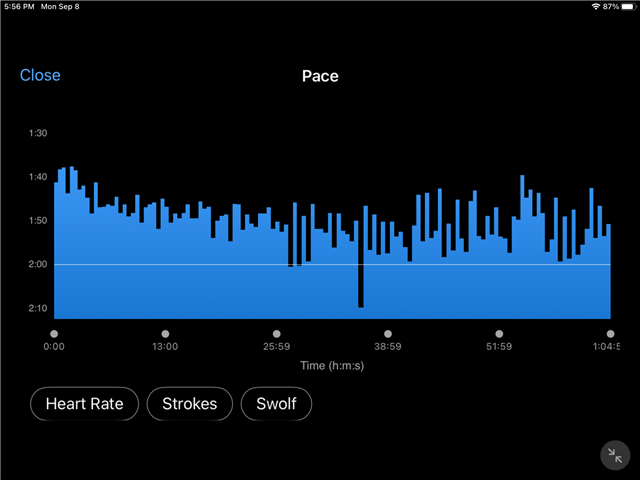
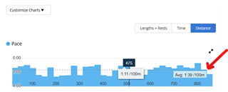
- in the Connect website, average pace isn't superimposed on the pace chart (as a horizontal line), like it is in the app, so I'm not sure if there's a direct comparison to be made. (We could compare the average pace numbers in the app and website tho)
- it def looks wrong (the average pace looks way too slow)
My questions for 7709844 would be:
- The average pace based on the chart looks close to 2:00. If you rotate the device back to portrait, does it show 2:00 (or something close) for the average pace (above the chart)? Same question for the average pace in the stats tab.
- To trux's point, what's the average pace (number) displayed in the Connect website (connect.garmin.com)? Is it the same as the number in the app?
My guess is they would all be around 2:00, which does seem wrong. But I'm not a swimmer, so I don't know if there's some nuance about average swimming pace in Connect that I'm missing here.
In the Connect website, I was only looking at the fullscreen pace chart mode (which doesn't show average pace). But as you pointed out, it is shown normally.