Daily Heart Rate Graph color keeps changing (solid RED to Multicolor)

Why does my daily heart rate graph keep changing?

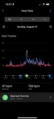
Some days I have the new gradient multicolor graph, starting with red at the very low HR, with multicolor to signify the HR zone I'm guessing. 

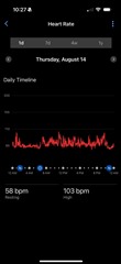
But other days I have a solid red line all day long, regardless of the value of the HR. 

I honestly dont ming either one, i just want to understand the inconsistency, why some days one vs the other? 

  • I honestly dont ming either one, i just want to understand the inconsistency, why some days one vs the other? 

    Yeah, others have noticed this too.

    Personally I noticed that all of my daily HR and activity HR charts are now (retroactively) changed to the new style, but other people have noticed a mix of styles like you.

    It's kind of baffling. Almost like a weird form of A/B testing except I don't think that's how you're supposed to do it.

    starting with red at the very low HR, with multicolor to signify the HR zone I'm guessing. 

    Yeah, except that red is also used for zone 5, so it makes zero sense to also use red for the low HR. And others have also found that red is used for "middle" HR too.

    Some ppl have posted multicolour charts where the lowest heart rates are red, values that are little higher (in zone 0) are grey, but values even higher than that (still in zone 0) are red again. Values even higher than that are coloured according to the zones.

    Also, the "low reds" aren't just for very low absolute HR, but also for the lowest *relative* HR. Like if I look at a running activity, and my HR started around 100, that relative low at the beginning will be colored red (while the rest of the graph will just use the zone colours as usual).

    But on the daily graph, my lows are obviously much lower (~50), and it's those relative lows which are colored red. An HR of 100 on the daily graph wouldn't be red.

    Then ofc there's multicolour charts where the colours are only used for the zones and the relative lows are not red.

    So really, I have no idea what Garmin is trying to do here.

  • Also, do you mean:

    1) on some days, all your (historical) graphs are red, and on other days, all your (historical) graphs are multicolor? (IOW, the graph for August 14 is sometimes red but sometimes multicolor)

    2) or do you mean that the historical graphs for some days are always red, and the historical graphs for other days are always multicolor? (IOW, the graph for August 14 is always red, and the graph for Aug 17 is always multicolor)

    I assume you meant 2), but I'm not 100% sure.

  • you are correct (2).   august 14 is always red... while aug 17 is always multicolored... 

  • yeah that doesn't make sense to me. I agree garmin should just be consistent and stick to one scheme. it seems to me they're still trying to figure things out (like how the multicolored graphs have inconsistencies when it comes to the red tint for lower heart rates)