This discussion has been locked.
You can no longer post new replies to this discussion. If you have a question you can start a new discussion

Why do I see inconsistent power data on graphs?

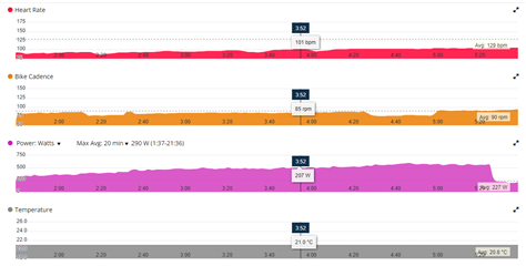
Today I did a session on my Elite Tuo trainer, recording it on on my usual Edge 130 plus and noticed that the power readings were absurdly high in the warmup. In fact they ramped up to near 600W! I would expect it to be mostly in the 200s.

But the thing that makes this a question about Garmin Connect Web is that the graph is showing inconsistent power numbers. The graph itself shows the ramp up to implausible levels, but the displayed numbers are only incorrect for some of the graph. For part of the incorrect graph, it displays numbers that are much lower.   I attach a screen graph where the graph is over 500W and the number displayed when I position the pointer over the chart is 207W.

Any ideas on what is happening here and how I can get more consistent data for my training sessions?
  

  • How does the graph look like when you select None instead of Max Avg 20 min?

  • No idea how you guessed that might be relevant, but that removes the inconsistency between the displayed numbers and the graph! Could you elaborate why?
    (I still have excessively high power numbers for the start of the warmup, but that is likely nothing to do with Garmin).

  • Could you elaborate why?

    I do not know why it happens, but I wanted to see the whole picture, where the Y-axis scaling could differ, not only the start.

    I still have excessively high power numbers for the start of the warmup, but that is likely nothing to do with Garmin

    Yes, it is more likely coming from the trainer, but to be sure record the next ride simultaneously with another app, such as for example Zwift or similar, and then compare the data.