This discussion has been locked.
You can no longer post new replies to this discussion. If you have a question you can start a new discussion

why does my public profile graph sports I don't do?

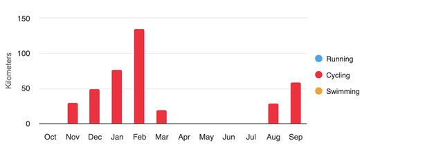
When I look on my public profile, it shows a graph of running, swimming and cycling distances. I don't do the first two, but I do walk. 
Why can't I select which sports I want shown in that graph?
It says

  • What I DoCycling, Walking, Weight Training

But then has this silly graph. Seems like a pretty basic bug.

  • I see only Cycling (red bars) on your graph. 

  • Why can't I select which sports I want shown in that graph?

    That is how it is designed so not a bug.

    Send your request to Garmin: Share Ideas | Garmin 

  • Because I don't run or swim. That's my point. Why can't I choose the sports that show on the graph? Why does it meaninglessly show a yellow spot for swimming and a blue one for running?

  • Ok. Not a bug, a poorly designed feature then.

  • Bc those are the core sports for Garmin devices.

    Besides, it would be tough to graph strength training on a chart which shows total activity distance. And some ppl might not want walking distance to be included in activity distance totals (since walking is much less intense than running, cycling and swimming.)

    I get your point though. It would be nice if there was also a graph showing your total recorded activity for all activities. And it would be nice if the data was automatically tailored so it's personally relevant to you.

  • Why can't I choose the sports that show on the graph?

    Because it is consistent, unified, normalized graph for all users, with the three basic most used sports. In this way people viewing the public profiles can compare individual users quickly. If every user had graph with different sports, it would not be really helpful for any quick comparison.

    If you want to see the graph with different sports, use rather the graph in Reports: https://connect.garmin.com/modern/report/17/all/last_year 

    Why does it meaninglessly show a yellow spot for swimming and a blue one for running?

    Because it is a legend of the graph, and it is fixed for everyone in the same normalized way. Again, making it consistent among all users, and easier to compare each other. And that's exactly the purpose of the public profile. To me it makes perfect sense, however if you wish to have it differently, as already recommended, suggest it to Garmin at Share Ideas | Garmin. If there are numerous similar requests, there is a chance they change it. However, personally I think most people either do not care, or understand the purpose of the legend.