This discussion has been locked.
You can no longer post new replies to this discussion. If you have a question you can start a new discussion

Training Load Focus Card Overflows

The Training Load Focus summary widget/card has a bug where the dotted optimal range overflows outside the card borders.  See the Image:

Firefox Load Focus Widget       Chrome Load Focus Widget

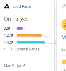
The above images are the bug in both Firefox  and Chrome respectively.
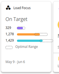
  • Hmm this was reported previously and Garmin claimed they fixed it. I guess they missed an edge case. It’s worth noting that the mobile app, despite having a similar design for the load focus card, doesn’t have the same bug.

  • Formatting appears to be correct for me with Firefox on Manjaro Linux:

  • I'm on Linux Mint. Should have mentioned that.

  • Formatting also appears to be correct for me on Linux Mint Debian Edition (LMDE) 6 on the same hardware:

    Not that I can see it making any difference, LMDE 6 is using a 6.1 LTS kernel and Manjaro is using a 6.6 LTS kernel. Both are using the Cinnamon Desktop Environment but I can't say off hand which version each is running.

  • I Wonder if it is an edge case with the specific load.  I'm training for a marathon in September.   Might be a weird optimization ratio being revealed

  • Possibly. However the other times I have seen this rendering error is when one of the values is extremely over the optimal range and another is extremely under the optimal range.

    What watch are you using? I'm wondering if this is an artefact of what metrics your watch gathering. Your watch reports your Load Focus as On Target when in the optimal range but my f6X reports Balanced when in the optimal range,

  • I've got the FR255 and it's just got a race scheduled on the calendar.  There's no official training plan loaded.

  • I Wonder if it is an edge case with the specific load.

    It’s clearly a bug and it’s clearly an edge case that wasn’t tested (*). Idk why ppl love to respond to bug reports with “it works for me although my situation is clearly different.” 

    (*) As I’ll expand on below, I think the edge case is that your low aerobic optimal range has a higher upper limit than your high aerobic optimal range, which doesn’t seem to be the case for most ppl, including myself and the other poster. It seems that most people have high aerobic as the optimal range with the highest upper limit.

    Are you also seeing this on the mobile app? If not, that’s even more ammunition to suggest that it’s a bug in the website, similar to the previous one (which also did not affect the mobile app.) 

    Previously when I saw this bug, my middle graph actual value (high aerobic) was well over the optimal range while my bottom graph bar (low aerobic) was within the optimal range. In my case, the high aerobic actual value overflowed. This was also the case for other posters iirc. The graph seemed to be scaled so that all the optimal ranges fit (which meant that the highest optimal range would be at the edge of the tile), without any regard to whether this would cause any actual values to overflow.

    This is clearly a different situation, since the bottom (low aerobic) optimal range is overflowing.

    I think what happened is somebody probably assumed that the middle (high aerobic) optimal range would always be the range with the highest upper limit (since that’s what most people’s optimal ranges look like), so their graph scaling algorithm probably looks like this:

    Scale graph so that…

    - …the high aerobic optimal range / value fits (this is probably existing criteria from before the previous bug was fixed, and it was probably never changed). Note that this would cover the vast majority of cases where no other value/range is higher than the high aerobic value/range

    AND

    - …all the actual values fit (this would be new criteria to fix the previous bug, but it wouldn’t cover this new edge case)

    Like to me it’s funny, because they are clearly incapable of getting it right for all valid cases, without receiving multiple bug reports from end users. Like instead of identifying all possible scenarios and testing them, they write code which handles a few common scenarios, and wait for users to file bug reports about the edge cases they missed. When they fix one edge case, they don’t bother to go back and try to identify other edge cases, instead waiting again for users to file more bug reports.

    Except ofc the previous bug didn’t even appear on the mobile app, so maybe it’s just one of their teams which can’t get it right.

    All they have to do is scale the graph so all optimal ranges and actual values fit. 

  • Your watch reports your Load Focus as On Target when in the optimal range but my f6X reports Balanced when in the optimal range,

    You’re comparing apples and oranges. d_cubed’s load graph has all 3 values within the optimal range. Your load graph has 2 values within the optimal range and one value above the optimal range. To me it makes sense that Garmin would identify these as two different situations and label them differently.

    I Wonder if it is an edge case with the specific load. 
    Possibly. However the other times I have seen this rendering error is when one of the values is extremely over the optimal range and another is extremely under the optimal range.

    Did you consider that this might be a *different* edge case than the one that was widely reported before? Especially since Garmin fixed that one?

    One of way of looking at it is it’s the “same bug” (bad scaling algorithm), but the previous fix only addressed the one edge case that was widely reported, so this other edge case still triggers the bug. If they fix this edge case, they’ll probably leave some other edge cases unaddressed until they get bug reports.

  • The bug does not appear in my Garmin Connect mobile app on Android