This discussion has been locked.
You can no longer post new replies to this discussion. If you have a question you can start a new discussion

Lets make a list of what was removed from the 2024 redesigned dashboard + bugs.

For reference (since there are no changelogs for the web interface), to collect what needs to be requested from support, just as an overview, to track what was actually brought back over time.

First thing:

The older interface had options for every widget: small layout, big layout, show todays data, show long term data, graph or text. This probably won't come back. On most of them it was possible to scroll through past days/activities directly in the widget. They provided links you could "open in a new tab".

So lets see what was removed:

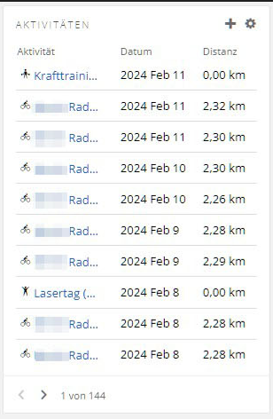
List view of last 10 activities with direct links to the activity and the option to scroll back further.
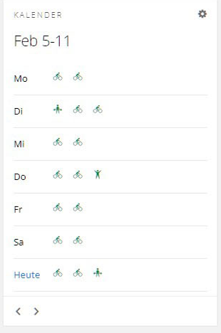
Calendar view.
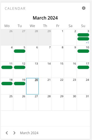
Calendar used to also do that.
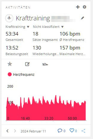
Details about last activity (still kind of there, just with less details).
Weight graph over the last days (current weight widget only shows the last single measurement).

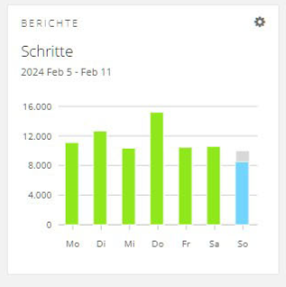
Steps graph showing the past days.
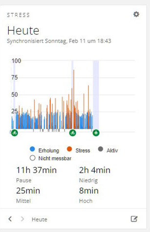
Stress graph was way more detailed.
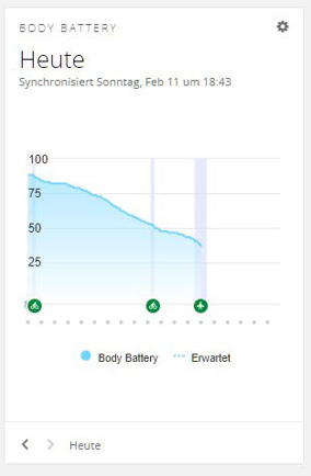
Same for bodybattery.
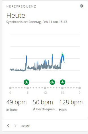
And the heartrate screen.
Not possible to show badges anymore.

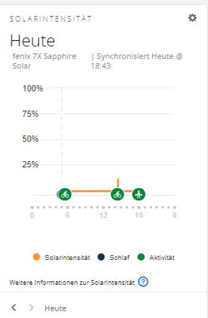
No solar data.
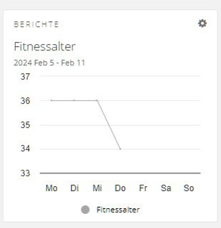
Fitness age used to show past data.
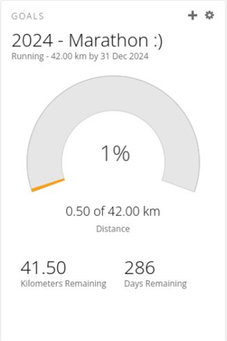
People were able to track various goals.
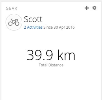
It was possible to have an overview of your gear.
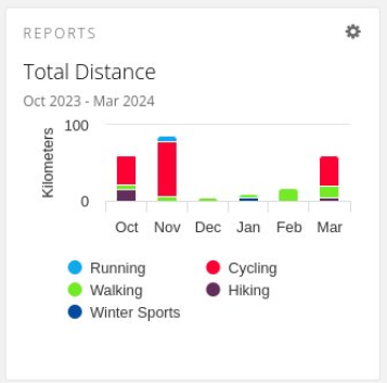
Graphs used to use colors to give you some information (instead of being useless now).
Bugs:

This graph extending out of the box still needs to be fixed.
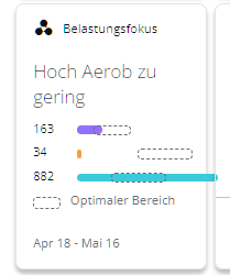
Data missing.
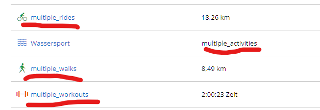
What else is missing or bugged?

  • Bug:

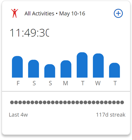
    Activity time total- final digit is cut off. Also, the tile has zero in the way of usable data. Oh look, pretty rounded columns! What do they mean? (nothing. they mean nothing. just taking up space)

    *I did report to Garmin and they stated they had submitted a ticket to the design team. When I followed up 2 weeks later Garmin informed me they would not be correcting at this time. 

    Sleep data (and this is going back to a previous change). You used to be able to use overlays to compare HR, pulse ox, resp, etc to each other during sleep. Now you can only compare one at a time with your sleep stages. The graph is also less detailed, smaller and is in b/w only, so very difficult to gain any detailed insight.

  • - Newsfeed... I was able to see what my friends were doing on my dashboard

    - Segments.. The old dashboard did show a list of my segments, you could also switch between done/favorites/all segments.  Right now i don't even know how to see a list of all the segments i ever did..

    - LINKS .. The dashboard used real links i could middle-click on to open a new tab

    - Workouts.. my dashboard showed a list of workouts i have setup

    - Routes.. Dashboard did show a list of my routes

    Don't have screenshots though..

  • The big thing that has been removed are the dashboards and with that the quick and easy way to view that data. Everything is still there, but you have to click links in the menu. In your post it sounds like the data isn't available anymore. Like "Not possible to show badges anymore.".

  • Amen!!   What are the odds that an exercise community with tracking devices MIGHT WANT TO TRACK THEIR OWN PERSONAL GOALS & TOTALS - and AS THEY DEFINE/DECIDE???

    Why Garmin did you take away the ability to dashboard GOALS and BASIC PERSONAL TRACKING logs - Not to mention YOU COULD NEVER SEE GOALS on the App - but at least we could on desktop!!

    Now even goals DON'T ACTUALLY SHOW YOUR TOTALS AT A GLANCE ONLY THE % DONE????

    AWFUL user acceptance, requirements gathering and even worse rollout.   Similar feedback was given in Beta - But IGNORED