Garmin -
If you are paying attention, you are seeing a lot of complaints about the new website. Please take these seriously. Your design team has seriously led you astray with these changes.
This thread is to provide specific pieces of feedback to help you understand the frustration (at least from these users) of what about the new interface is unappealing. The other threads are good to see the volume of discontent. I hope this thread can be turned into internal bug reports at Garmin to make fixes.
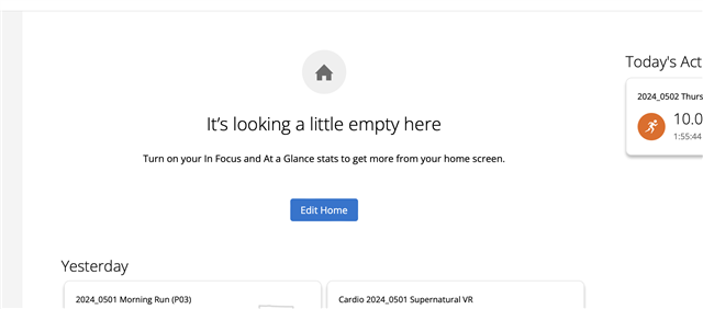
Let's start with the new home page. I personally do not find the new summaries "In Focus" and "At a Glance" useful or helpful. So, I turned them off. And that yields a big empty space telling me to add them in. See screenshot. If a user wants these off, do not waste the space. Move the activities around to be the center of attention.

You are seeing a lot of complaints about removing widgets. For example, I rotate through numerous pairs of shoes. I would like to see a summary of my gear at a glance when I update my workouts. That is now completely divorced from the daily flow. I have to manually go to the Gear page (unless I max out miles and then I get a notification). If you are going to give me a new home page, give me data I want.
Why are yesterday's activities not sacked under today's? Your design team is mixing metaphors between their alignments. Just stack them altogether, similar to the flow in the mobile app. And flip the location between the right side of the screen (less important) and the summary real estate area on left (primary area). Further, given an option to see the entire week of activities too.
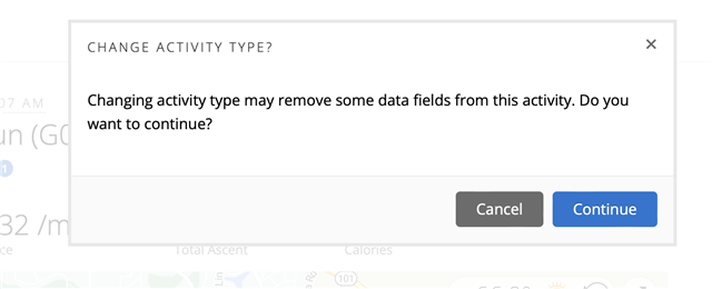
Previously, I could edit an activity on the home page. Now, I must use an extra click to get to the large page. And something as simple as changing the activity type (say from Running to Street Running) forces me to confirm the choice EVERY TIME. Please give me an option to turn off that notification. This notification was not present in the home page edit flow.

This is particularly useful when changing activity types within the same category where the fields do not really change.
I invite my fellow frustrated Garmin users to post their requested fixes to this thread.


