This discussion has been locked.
You can no longer post new replies to this discussion. If you have a question you can start a new discussion

New Garmin Connect UX is terrible!!!!!!!!!!!!!!!!!

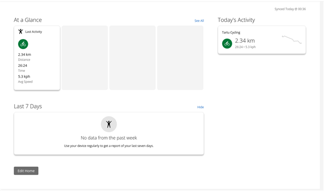
The new Garmin Connect UX is appalling! How can anybody create something like that????? It provides tons of useless fields and not teh field I need! I want to have my goals for this year displayed first - I did not figure out how to do it. And at the same time, there is information that I do not want. And when I  switch off teh useless data, then it is telling me that my home page is EMPTY.... 

  • Sorry dude, but no Goals for you anymore. They now have the all mighty "high quality" Focus and Glance that does the all magic for us.

    Look at this magnificent dashboard I have(with all the information that makes sense to me). Good job Garmin!

  • I am glad I am not the only one :-) I felt I am maybe an old fart not understanding UX, but then I saw all the other comments!