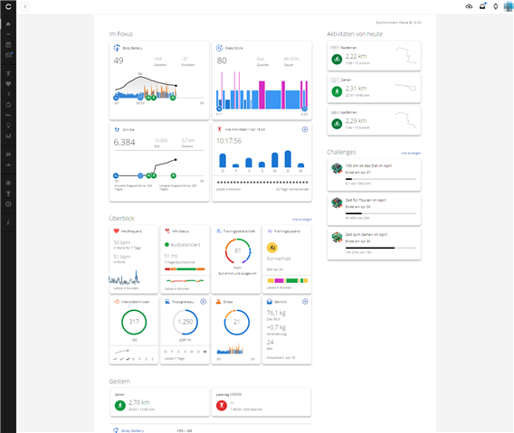
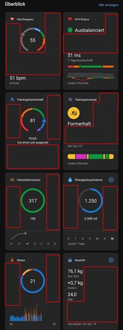
My first thought was, do I need the side-scrolling "In Focus" at all? But disabling it costs me one directly visible information slot in the App and six on the Desktop.
So I need to find one widget that is important enough to be shown right in second place after todays activities on the phone and 5 more that are not that important so I don't have to side-scroll, but still important enough to be on top in the Desktop view (like sleep, HRV, weight graph, but then the last two are not even available). I don't even see 6 relevant (for me) widgets that I could use the space for "in focus" on Desktop fully.
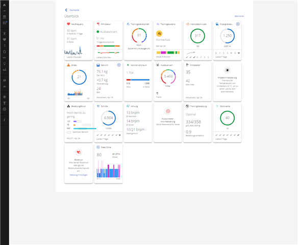
Then there is eight slots in "overview" in both. Or I could bookmark my Desktop view to "show all" and have 20 info slots on Desktop. But them I'm loosing in focus there, or I double the Information I have in "in focus" so I can see everything at once on Desktop (14 (6+8) vs. 20 information slots) and have "in focus" on the phone (where I probably won't expand "overview").
I would also have to look at what widgets have more value when shown in "in focus" instead of "overview".
But all that does not help that I am now missing:
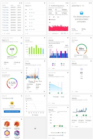
- my last 10 activities
- calendar view
- statistics of last activity
- weight over several days
- 7 day steps graph
- heartrate graph with activity icons
- badges
- solar intensity
And of course it's dumb to have to scroll so much on desktop when it has unused space in width.


