This discussion has been locked.
You can no longer post new replies to this discussion. If you have a question you can start a new discussion

The new web home page is a JOKE

I tried the beta and went back  to the good non beta that shows all the info I want in a manner I want to see it, then when i logged in this morning i was confronted with this
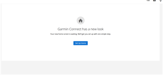
And on pressing the blue button I was confronted with this
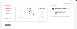
This is of little use to me really as even with in focus turned on  as I have now gives me very little useful info like my dashboards used to
  • Looks like the feedback from beta testing was thrown in to a virtual bin (at least mine was).. and they released that crap anyway... GG Garmin, nice way to piss off you users...

  • Has Garmin done anything at all in the beta?

  • This is what Suunto did.. They redesigned the app(movescount - suunto app) then They killed the web app/page which then killed of many of their users and watches as they could nolonger function fully. Was an ambit 3peakuser when they killed

    This is exactly what I experienced with Polar when I was using a RC3 GPS watch. Suddenly they decided to discontinue the web service and my 2 years old watch was unusable, because it was not compatible with the new web service. Then they offered a minimal discount for buying a new watch.

    https://newsletter.polar.com/newsletter/global_en/PPT_closing/ppt_gen_distributor/index.html

  • How can it be better if most of the things we use are gone? Who tested it?
    And what exactly has been improvement to old interface? I see none.

  • I get that a lot of people don't own or have access to traditional computers but don't forget tablets. As the mobile apps don't play nicely on a screen larger than a smartphone the Web interface is your best bet on a tablet. 

  • Although nice (more modern) design wise, functionality is so much worse.

    Before:

    • I could configure the widgets to show e.g. the past 6 or 12 months for some values (e.g. number of steps per month), which was much better to see overall fitness development over time
    • I could see the last few activities at a glance

    Now pretty nothing can be configured.

    The widgets might be nice for the "fitness" oriented users, but not for those who want to see more details about their trainings.

    And where are the multiple dashboards? ... e.g. one for fitness, one for running, one for cycling activities?

  • So, someone at Garmin decided to take a good looking, easy to read, customizable web interface, and a functional, slick, easy to use Android app, and combine them into a single multi-platform app that makes both platforms less user friendly, less functional, more complicated and ugly? Sounds like a cost saving exercise - one app that tries to do everything, but in practice is a big step backwards. I'm surprised that a respected company like Garmin would think this is anything but detrimental to the overall user experience.

  • Bring back the Dashboards!  Also any change you make on the App is changed on the Web version (at least on IOS to the Web version).  All my gear tracking by sport Dashboard with separate goals, leaderboards, and other information is now either gone or multiple clicks and back clicks to get to all the information "I" wanted to see on a single page.  Please bring back the Dashboards for WEB!

  • I would disagree that the app is an improvement, I think it to be a complete downgrade. They dumbed everything down. I think it is just as bad, if not worse than the webpage but that is another topic completely. 

  • Tbh I lowkey hate the new app home screen but I understand why they did it (“simple = good”). 

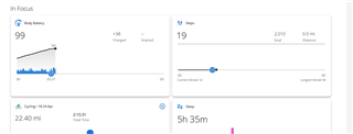
    I dislike the fact that In Focus forces you to swipe left and right on an otherwise vertically scrolling page. I hate that if you want to see all the At a Glance tiles, you’re taken to a whole new page. The titles of these sections are basically false advertising. You see stuff in focus and at a glance as long as it’s just a small amount of data. Sucks to be you if you want to see more without extra taps and swipes 

    I get that many ppl thought the old home screen was cluttered but this is a step backwards for me. I feel like I’m being punished for wanting to see more data. 

    I only say it’s arguably an improvement to give Garmin the benefit of the doubt and bc some ppl have expressed that they like it better. (You can guess they’re the type of person who don’t want to do anything on their laptop, which is fine.)

    ofc if I had my way everything would be vertically scrolled and/or expanded on the same page. Pretty much exactly the way it was before haha. 

    Having said all that, it makes zero sense to put all of that on the Connect website and take away all the functionality most of us used to love. Except ofc when you consider that Garmin wants to save money on software development. Just another example of ens—tification that invariably happens with tech products and services that used to be good, but when they get popular they turn to garbage.