This discussion has been locked.
You can no longer post new replies to this discussion. If you have a question you can start a new discussion

Pace scale way too long!

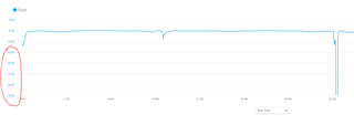
Why do they show the pace like this?

There is a huge scale on the side, and if I'm running between 5:00 and 5:30 I can't see where I was faster or slower because it just looks like a flat line. I don't need to see where it drops below 6:30 because I'm probably stopped waiting to cross a road or something. 

  • The automatic scaling of the graphs is mostly unusable. For about 10 years now, the graph for altitude has also been unusable. I've already pointed out this problem several times and asked for a way to manually zoom in the charts in the y-direction. But unfortunately without any success. I don't understand why Garmin not address this issue.

  • Agreed, this is especially bad for interval workouts, where you're guaranteed to have periods of slow to no movement (unless you pause your watch during rest intervals, which I don't want to do.)

    Funnily enough, the Connect mobile app handles this by cutting off the graph at 10:00/k and it works great (for me). The Strava app and website are also ok at doing this.

    The stryd app is also pretty bad, with a graph whose scale ranges from 5:00 to 20:00/km for a workout with paces ranging from 3:24/km to standing still. Although data points faster than 5:00/k are graphed, the scale flattens differences between paces such as 3:30 to 4:30/km.

    Runalyze (a free website that syncs with your Connect account) handles this by actually linearly plotting speed (not pace) by default. You can also change the plot setting to linear pace (or reversed linear pace), as well as setting min and max y-axis values. (So if you want something like the Connect app, you can set the scale type "reversed linear", max y-axis pace = 10:00/km, min y-axis pace = automatic. In this context, min and max refer to pace values, so lower = faster and higher = slower.) There's also an option to ignore outliers.

    Really, runalyze is giving you a level of customization that no mass market app or website (like Connect or Strava) will ever provide. They'll just decide what's best for the user even if it actually sucks.

    I think the problem here is where coders for the Connect site and Stryd app aren't really thinking about how human beings are using this data. They just see pace which ranges from say 3:00/km to infinity/km (standing still) and decide "oh we have to figure out how to graph this somehow without losing too much data!" without considering the fact that we probably don't care so much about our exact pace when we were standing still or moving very slowly (slower than 10:00/km) during an interval workout. Really, as far as I'm concerned, a 10:00/km cutoff is fine if you're obviously doing an interval workout. OTOH, if someone runs a steady state run which averages around 10:00/km, the software should be smart enough to figure out that's their actual running/walking pace. Given that Garmin already tries to auto-detect intervals, it should be smart enough to figure out how to graph them usefully.

    One of the root causes here is that runners use pace (i.e. 1/speed), which necessitates the use of a cutoff (or logarithmic plot) in the first place (standing still = infinity minutes/km). Most or all of these problems would go away if the graphs just displayed speed. Ofc speed is practically useless for runners.

    But yeah, it would be great if we had options to customize the y-axis, but I'm guessing that will never happen.

  • Yes, you've nailed it. But it's not just the intervals that unnecessarily increase the y-scale. The same thing also happens when you simply have to stop briefly at traffic lights.

  • And although with GC Web it's possible to zoom into the x-axis, the same feature isn't available for the y-axis.

  • Yeah it would be nice. But I guess my main point is this is clearly a problem across multiple platforms. For once, it’s not just a Garmin annoyance. And it all goes back to the use of pace (1/speed). We can see similar problems when ppl just talk about pace in plain english. There’s a conflict between the common sense English definition of pace (basically synonymous with speed), and the use of pace in the running world as “the amount of time it takes to cover a certain amount of distance” (e.g. in minutes and seconds per km, or minutes and seconds per mile), which is the inverse of speed. Sure, we could say that it’s just another way of describing speed (which it is), but when it comes to the actual numbers, there’s a problem.

    e.g. What does “higher” pace mean? Most people would interpret that as “faster” (which makes sense outside of the running world, where pace = speed), but a pedantic math nerd like me might think it should mean “slower” (although I would never use that definition since it would confuse people). Then again, runalyze uses the “correct” (yet unintuitive) definitions of “higher” (slower) and “lower” (faster) pace for its min/max pace graph settings, which was confusing even to me (since I expect everyone to use the common definitions.)

    Same as when people say “zero pace” for standing still. Actually, standing still is literally infinite pace, but nobody would say “my pace was infinity minutes / km” when they were standing still. It’s interesting to me that Garmin watches used to show “—:—“ for pace when you were standing still (or moving below a certain threshold), but now they display “00:00”, which is arguably “wrong”, but makes sense to the general public who doesn’t really care about numbers.

    Speaking of pedantic math nerds, I’ve seen some people argue that the pace graph should be inverted, so that lower pace numbers are on the bottom of y-axis, and higher numbers are on the top. While this is “correct” from a numbers pov, it would again fail to make runners happy since, let’s face it, we all think of pace as being synonymous with speed. Nobody wants to see a graph that dips when you run faster.

    I think actually graphing speed is the best solution, but normal users wouldn’t understand why the y-axis isn’t linear, so it’s never gonna happen.

  • Anyway, my suggestion is to use the Connect mobile app if you want a better graph of your pace. I would also suggest runalyze, except it seems to do certain things with your data which makes it different than what Garmin shows. e.g. For me, runalyze pace graphs never show the same highs that the Connect graphs show.