This discussion has been locked.
You can no longer post new replies to this discussion. If you have a question you can start a new discussion

Beta Connect Web

Hi

I have beta acces to Garmin Connect web for a several days.

Am I only one who thinks that is terrible? Big step back. 

I have 27 inch screen with QHD and most of my background is empty, because the single fields are very small, acording to mobile desing. 

Plus im missing lot of features (widgets) which was only on web connect. Such as calendar, activites of my friends, my gear, my goals...

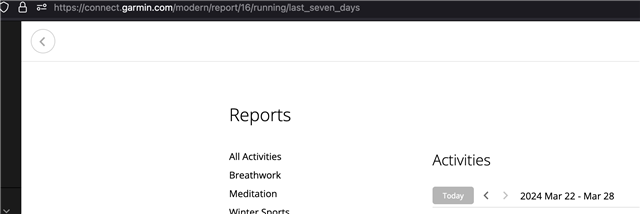
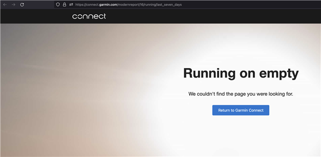
Now i have to find the in menu, in separate kategories. This change is not good, it is even worse then before. 

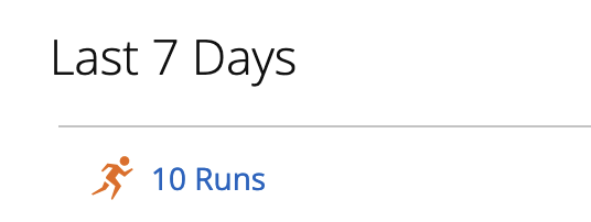
New dashboard shows much less information then before + i cant even show them up. Now the Web connect = mobile connect. Why? 

Thx for help. 

  • Exactly what I am afraid of, one of those updates that leaves you with less features instead of improving and fixing stuff.

  • yep.... new look, maybe sleek for some, but way less information.

    It displays only 6 tiles in 'at glance', but there is a space at least for 20 on my screen.

    also i prefer to scroll down to see more instead of clicking 'See All' ...

    definitely they need some experienced UX/UI person - if it has macbook and spends time in starbucks - fire immediately !

  • Yeah it's terrible. They literally copy and pasted the beta home page from the Connect mobile app. While it's mostly an improvement on mobile (except for a few v annoying things I won't get into *), it's a huge step backwards for the website.

    I'm sure it's a done deal tho. As soon as the beta goes to production, we'll be stuck with the new look on the website and the app. I don't think they care, because:

    - surely the demographic that even uses the site is continuously shrinking (I know so many people who either don't own a computer or who insist on using their phone for everything -- I totally get it.) Too bad the website has many more features than the app. You can't even search activities on the app. Then again, both the website and app have a ton of usability issues and feature gaps

    - it's gotta be a lot cheaper to just maintain a single simpler codebase for the Connect home page for both the app and the site

    I can't see them maintaining the "classic Connect site" indefinitely (as they did years ago when the current iteration of the site was new.)

    (*) I lied, I will get into the annoying things on a mobile:

    - At a glance forces you to scroll horizontally (kinda defeats the purposes of selecting more than one item to be shown "at a glance"). Idk about anyone else, but having multiple scrolling regions in separate directions (horizontal and vertical) sucks on mobile, except in certain limited use cases. (Like maybe when the horizontal scrolling is rare, as opposed to a daily thing, or when it's used to flip between "tabs")

    - In focus hides tiles if you have more than 8. You have to press "see all" which takes you to a whole new page. Almost as if they're punishing you if you want to see more data

    - Activities from yesterday are no longer shown on the home page (which is annoying for me when it's a rest day and I want to glance at what I did yesterday)

    I think everything should be vertically scrolled, and if they must hide "extra" tiles, then allow them to be expanded (vertically), instead of taking us to a new page or forcing us to horizontally scroll. That way, they could also persist the expanded state.

    I mean, the Connect app and website have always had a ton of issues. The new home page is kind of a step in the right direction, but they clearly optimized it for people who want to see less information. That's fine, but why ruin the experience for people who want to see more?

  • Also, the only reason I use the Connect website in the first place is because it's different (has more features) than the app. (I use both the website and the app because they have different strengths and weaknesses).

    If they continue to make the website more and more like the app, for me it will just serve to kill the website. I'm sure they wouldn't mind if everyone stops using it and they no longer have to maintain it..

  • Now that i have access to the connect web beta I have to agree, currently it feels like a step back in terms of usability.

    - I can no longer right-click to open stuff in a new tab.  Basically everywhere but I miss it most for activities (e.g. from yesterday last-7-days)

    - I'm missing the segments widget that shows all my done segments, not just the ones i have created or as favorite.  Don't even know how I can see that right now..

    - Show all for the glances leads to a new page, there should also be a way to toggle it to show all

    - A lot of the old widgets were useful as shortcuts, e.g. segments, trainings, courses. Totally missing that..

    - Only three challanges? There is a lot of empty space to show more..

    But i think it looks nice..

  • also no `daily summary` like before, where all information about last day (HR,HRV, battery etc.) were on a one screen.

  • - I can no longer right-click to open stuff in a new tab.  Basically everywhere but I miss it most for activities (e.g. from yesterday last-7-days)

    Yeah as a fullstack dev it really triggers me when my peers implement fake links that only work with left-click and not middle-click/right-click so you can open them in a new tab.

    It's all part of a really long-term trend to cater to the lowest common denominator of users who have zero tech knowledge. And the problem is that both the youngest and the oldest generations are the least tech savvy (in general).

    I'm a big fan of usability and simplicity, but this ain't it. (I could say the same about these forums.)

  • Generally I agree that the functionality of the new version is worrying, and I hope it won't be forced to everyone before it gets significantly improved. Therefore using the feedback form at https://connect.garmin.com/modern/settings/betaPrograms, and letting the developers know your thoughts, is important.

    - I can no longer right-click to open stuff in a new tab

    Ctrl+click does work in most cases for that purpose, even when the right-click does not. And it is faster, since you do not need to click twice (right-click + click on the context menu)

    no `daily summary` like before

    Yes, I miss it too, but fortunately as for now it is still accessible with the direct link https://connect.garmin.com/modern/daily-summary/2024-03-28 (you can click the Today button if you bookmarked an older link). Before it gets removed, I still do use it frequently. 

  • Ctrl+click does work in most cases for that purpose, even when the right-click does not. And it is faster, since you do not need to click twice (right-click + click on the context menu)

    I just checked and, in the connect website beta, ctrl-click *does* work for some links, such as activity links.

    However, if you click on a report link, such a Last 7 days > Runs, you get a 404.

    I just don't understand why some web devs are allergic to real inks and prefer to use javascript links instead. It's less accessible, less convenient and there's no benefit to the user.

    Left-click:

    CTRL/CMD-click:

  • However, if you click on a report link, such a Last 7 days > Runs, you get a 404.

    It actually (kind of) works - opening the link correctly, but unfortunately there is a slash between "modern" and "report" missing in the URL. When you insert it there, the page opens correctly. I know - it is not a comfortable solution. I am just explaining the reason, why the Ctrl-click does not work in some cases.