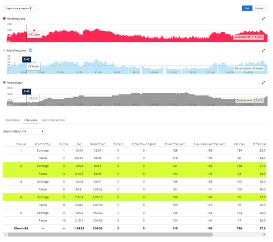
I think this is a visual aid. If you scroll to the right, the data on the left will be hidden, e.g. the interval number, the type of activity, the lap, etc. With the green coloring, you can easily stay in the previously selected important intervals. If you use a HRM then there are also data for running dynamics available and the row may be much longer.