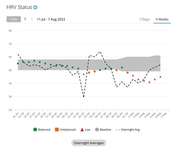
For example, on the HRV Status diagram it is obvious that points should replicate exact datapoints, while a line should represent seven-day average, and not otherway around.
Because usually you're displaying one data for each night, and then making a line chart to show the trend. Right now diagram is confusing.


