This discussion has been locked.
You can no longer post new replies to this discussion. If you have a question you can start a new discussion

Can we please get a colorblind mode for the connect app?

Nearly 10% of males are affected by some sort of colorblindness. It varies greatly between people but lots of games and apps have modes which change troublesome shades to colors or symbols that are easier to identify.

Some examples of trouble I have with the connect app:

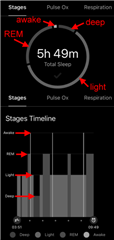
The sleep chart uses various shades of blue and purple which I cannot differentiate between.

The stress chart uses red orange and green between which I also cannot tell the difference.

  • I think it would make more sense installing a browser plugin, or adjusting directly the OS of your computer / phone / tablet for colorblindness. Fortunately there are plenty of tools that can help you. And it should help not only with Garmin Connect, but with most other apps and websites as well.

    I do not have much experience in that field, but a quick google query shows for example this link discussing Chrome plugins: Chrome Extensions For Color Blindness - Color Blind Awareness, though there are more tools available, both for browsers, as well as on the OS level.

  • I "suffer" from colour blindness. I find the colours on Garmin's app and watch for sleep (as well as others) very hard to differentiate. Garmin should sort it out. We shouldn't have to change our system settings because one manufacturer has come up with a poorly thought out (and non-user definable) colour scheme. Also your solution does not help out for reading the app or the watch. Presently I cannot even access the web browser through Chrome )I can through Edge but I do not use Edge) and I do not want to use a browser to read stuff that should be clear on my watch and app.

  • I find the colours on Garmin's app and watch for sleep (as well as others) very hard to differentiate. Garmin should sort it out.

    I'd tell they already did. Fortunately the Sleep diagrams are easily distinguishable even on a black & white screen. On the circle diagram, the sections are always in the same order, and on the Timeline graph, the height of the stages is in the same order too:

    1. deep
    2. light
    3. REM
    4. awake

  • I guess so but TBH there are plenty of colours they could choose (or allow user definable ones) so colour blind (not many colour blind people only see in b&w) people could still have sonething that is both informative and pretty to look at :-)

  • This is great feedback! Please submit this idea here.

  • This would be very useful, like was said a lot of males a colourblind. Most games have a colourblind mode that flip colours to opposing tones. 

    I don’t think installing a plug-in is helpful as will mess up all the colours on your screen which is not helpful.