This discussion has been locked.
You can no longer post new replies to this discussion. If you have a question you can start a new discussion

Can Heart Rate Zone be displayed together in the Heart Rate Chart? Like Polar Flow?

As titled. 

I am new to Garmin. But the heart rate chart itself isn’t that useful with only the average HR being shown. 

can Connect shows something like Polar Flow? 

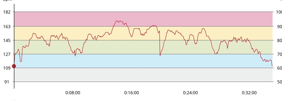
this way, it is easier to track when during an activity, and for how long a stretch, I am in a certain zone. 

Connect’s implementation is too simplistic. 

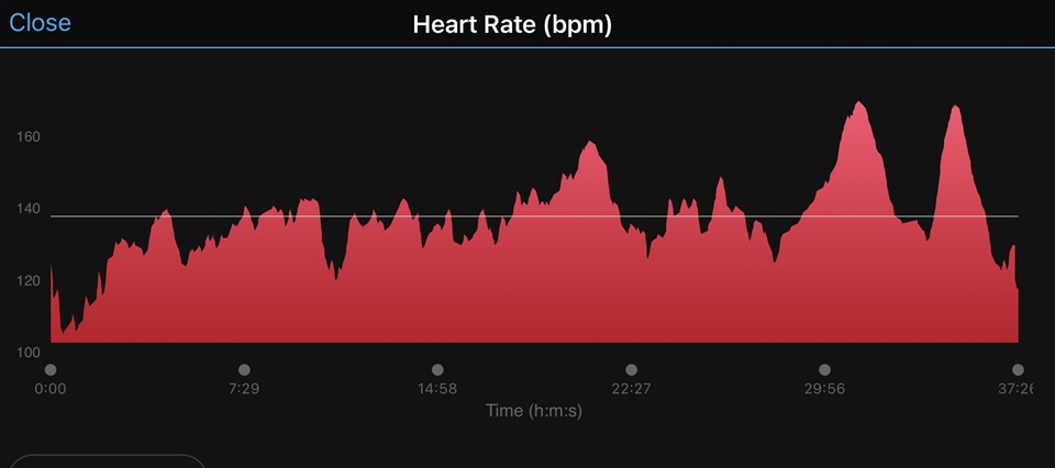
if I can’t do it, how can I feed that back to the developers? 

  • A chart can be enlarged and that's it for axis' scales customization.

    But there is Time in Zones tab, at the bottom, you can check % of heart rate in each zone for current activity.

    For feedback, open Contact on the main webpage and click on link for Submit Feedback (have an idea).

  • Thanks for the reply. 

    ya I check all other charts and none of them have what I am looking for. 

    I get that there is a zone bar chart. But that’s different from what I want. For example, you can spend 30 mins in zone 3 in a 50 mins workout, but that 30 mins could be 2 stretches of 15 mins and got a break in between them over time. 

  • Yup, it's different. Another option is heart rate path coloring from low to high (layers' icon on the map), still not the same though, so you checked correctly that such chart is not available.

  • sigh, that’s annoying. I even saw a 3 year old post in the forum asking for the same feature. 

    sent my idea to Garmin, but god know if that will ever be implemented at all. 

  • Not so clearly, but "kind of" you can see it in a similar way as you requested, on the all-day HR graph. Better viewable in Garmin Connect Web, since you can zoom the selected section, there. The coloring of the graph seems to respect the HR Zones, but I am unsure how well it works if you have several HR Zone tables for different sports defined, and do several sports in the same day.

  • ... and another option where you can see the HR Zones, although not on a time based chart, is the HR layer of the activity map. Personally I find it even more useful than what you request, in this way.

  • True, there is heart rate coloring for daily chart, but it's on other page so you can't follow an activity's path by hovering over it.

    So best option is path coloring on activity's map, which I also mentioned in my second post.

    The idea to add coloring for heart rate chart on activities' pages is good, that chart takes its space anyway, so making it more useful is reasonable. For sure some users prefer charts, other maps, so having more options is a good thing.