
I see great potential for improvements when it comes to the curves for Speed during activities. The speed curve is almost impossible to make any sense of. It jumps around like a child in front of a candy store. The problem is that the speed is way too exact. I’ve made a proof of concept for a “Smoothed speed curve”. But first to the next potential of improvement.
The other Speed curve that I would LOVE to have is the average speed. This thought began during roller skiing workouts. I noticed how I often glanced towards the watch to catch my average speed. Usually the speed drops as I get tired. But it’s a great key figure to evaluate the workout. There is no way afterwards to see how my average speed evolved during the workout.
Let’s look at my new suggested curves. I’ve exported a 40 km cross country skiing race ( 5 laps) from Garmin connect and imported it to a spreadsheet.
In the spreadsheet I've made some formulas to smooth the Speed and heart rate. I’ve also made a “setting” for how smooth I wanted the curves. So I can set a number of seconds that is used for my average calculation. To give an example. At row 6000 (100 minutes) that single value of the speed, would show the average speed for the last 15 minutes. The time is a variable you can change yourself and will affect the curve a lot. Longer times gives smoother curves. So you need to find a sweet spot. This should be customizable by the user. The height of curve is something that also should be customizable so what you can get better resolution where it matters. This is especially true for Heart Rate where the low heart rate of the start is of no interest.
This gave me an amazing speed curve that finally makes sense.
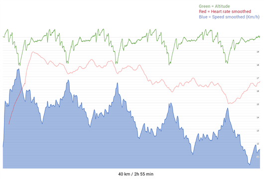
This first print screen shows the smoothed speed in blue. The red dotted line is the smoothed heart rate and the green curve is the altitude. It’s totally obvious how I lose speed for each lap.
Let's compare this side by side with what I get from Garmin connect: 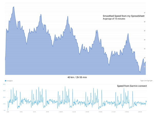
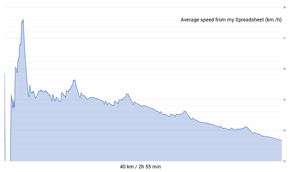
The next curve shows the average speed. It first drops below the roof (since it was crowded in the start). Then during the first part of the race it was a lot of downhill, followed by a steep uphill. Then the average speed really dropped. And as it’s average speed, it takes more and more to affect the curve. You can see that I managed to keep it relatively stable during the first half of the race, and then it dropped a lot.
You can all test out my proof of concept. Here is a link to the Google Spreadsheet. So copy and paste the link if you want to see and check the formulas: docs.google.com/spreadsheets/d/1rjqwyGgrCszePhxSoboUGKh7rr5eHcMK/edit#gid=1775017751
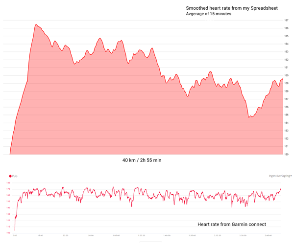
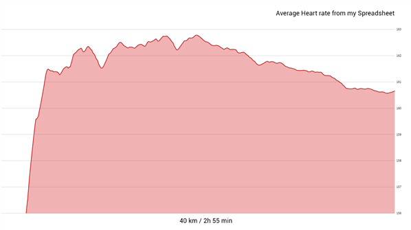
There are also more curves to look at. I've made the same thing with heart rate.
What do you think? This would be AMAZING to get in Garmin connect, especially for activities with fluctuating speed.
Feel free to try it out with your own data. Just make a copy of the sheet! I used Garmin connect in desktop to download a FIT-file from the workout and this service to convert it to a CSV-file: www.fitfileviewer.com

