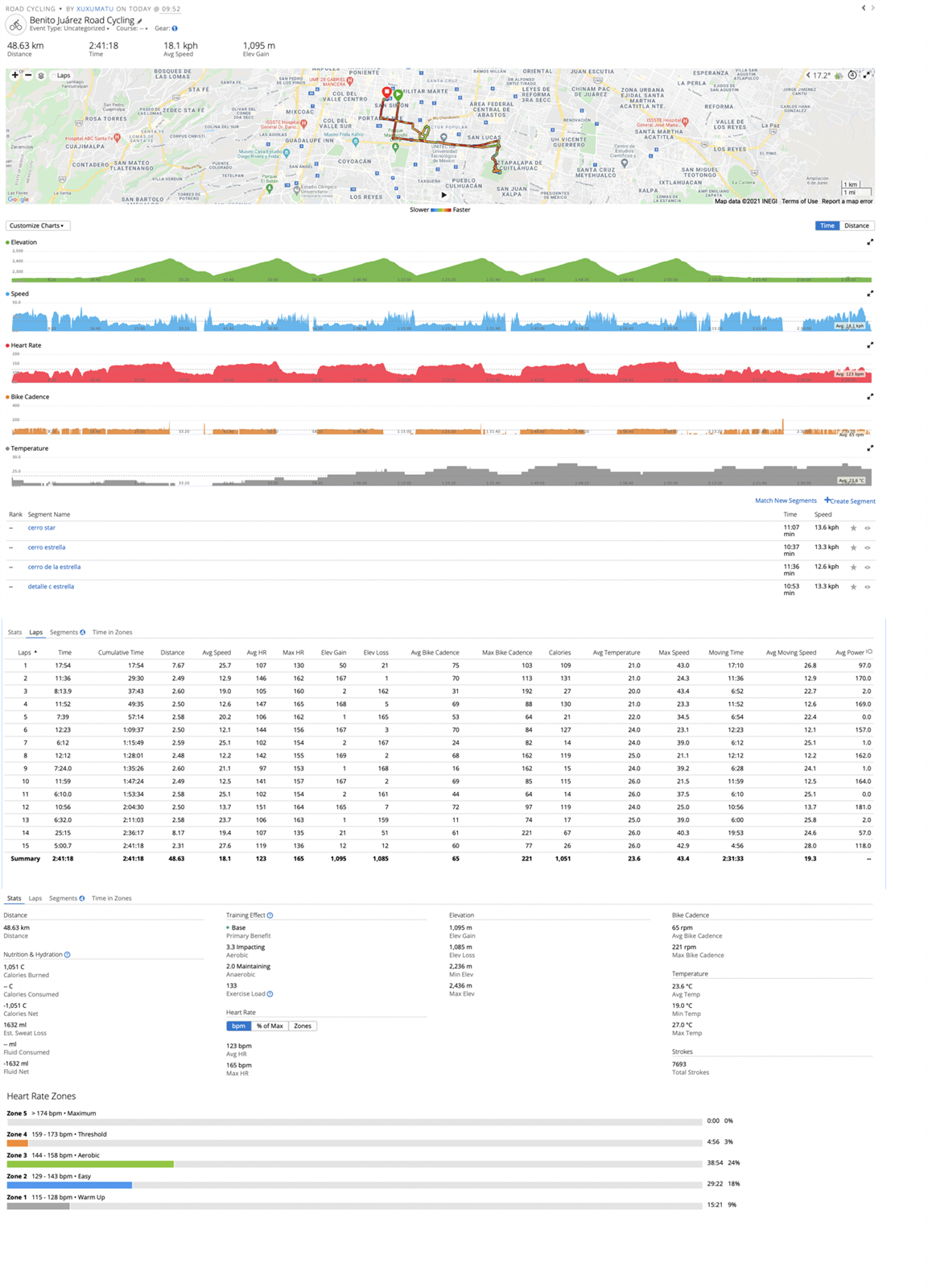
I almost sure that lap, segments and time in zones in web buttons are very useless and has almos none clicks so why don't use scroll instead of buttons and have all integrated data in one page??

That would be too long to scroll to wanted data, easier to use a button.
But ok as an option to unpin chosen tabs and display data from them in main view, could be useful for large screens.
I think there's something to be said for separating data into different sections to avoid information overload and to improve usability. With your suggestion, imagine that there's a large number of laps…
I think there's something to be said for separating data into different sections to avoid information overload and to improve usability. With your suggestion, imagine that there's a large number of laps (like 26 or 42 for a marathon).
Now we have two possibilities for dealing with that:
1) Have a scrollbar for laps. Now you have a scrolling section in the middle of another scrolling section, which can be awkward and annoying. (Imagine if you're trying to access Garmin Connect on a tablet -- to be fair the UX in this case is already pretty bad.)
2) Show all laps at once, to avoid the above situation. Assuming the example layout above, you now have to scroll past a lot of laps just to get to the summary or HR zones section.
At the very least, I think anything that requires further scrolling (like laps), should be at the bottom of the page (as it is now).
Also, ppl who have certain watches or sensors have a lot more graphs than the 5 in your example.