
I have two activities of Strength type. Pretty much the same routine, starting heart rate also similar (the warm up is identical).
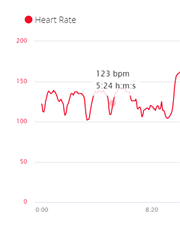
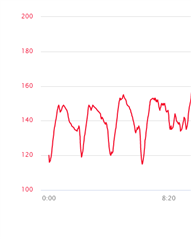
As you can see the scale is different. The one on the right side is much better as it allows to see the changes in more detail. The only thing I can think of is that in the activity on the left, there's a data point with no reading and therefore when the chart is built, the 0 is the minimum value. This is more of a bug report / feature request as I can't see a way to change the display of the charts