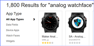
I've just got a new Venu so I'm excited to see what apps are available and to choose a watchface that I like. Excitement is immediately shot down by the shoddy store. Why is it ok to produce something this poor?
If I click on watch faces, I'm told I'm on page 1 of 43, yet there are only 4 pages of watch faces. Is it broken? Are there more watch faces I'm not seeing? Or is it just poor design? The same principle applies in the other categories.
How come there aren't any filters? Such as filter on digital or analog watch faces? etc etc
You might be able to tell that this sort of dreadful user experience really bugs me
Nick


