I just reviewed my Garmin coach planned run for today in the Connect web app. The run description no longer shows the target pace, just a text description, e.g. "Easy Pace". As well, the run description uses more vertical space on the screen, but doesn't use that additional space to display any useful information. It has just increased spacing between elements.
This is a VERY BAD redesign choice. Providing less information is very unhelpful to runners. Please revert to showing the pace information in the web app.

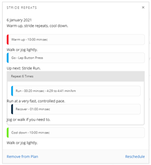 This is the type of run description I used to see.
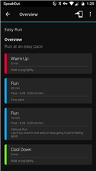
 And this is the run description that is now appearing, without the pace information, and wasting vertical space.