This discussion has been locked.
You can no longer post new replies to this discussion. If you have a question you can start a new discussion

Imported running GPX: wrong pace chart. Cycling is OK.

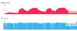
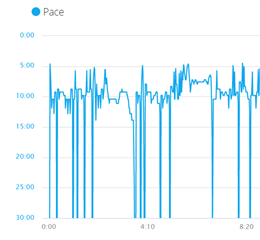
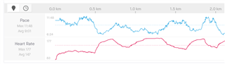
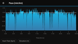
I'm waiting for my first Garmin smartwatch and in the meantime imported some GPX files from my Strava account. Cycling activities look OK but my C25K run/walks has only an averaged pace chart instead of showing the different speeds. How can I fix this?

  • You can hover mouse over chart's line to display value. So you can check if values are right or not. You can also enlarge chart using arrows on the right.

    Y axis is badly scaled, so unfortunately pace charts usually are too flat to view it graphically.

  • It's wrong there, too. 

    These are 10 min/km walks alternating with 7 min/km runs. The first 5 minutes, for example is a warm up walk. I know GPS is not very exact but it should at least somewhat correlate with the heart rate instead of being completely flat. Here is how it looks on Strava:

  • Y axis is badly scaled, so unfortunately pace charts usually are too flat to view it graphically.

    Exactly. This is a problem with most Garmin Connect (web) charts in general, but especially with pace charts.

    Pace is kinda tough to graph consistently, because it's the reciprocal of speed, so if you're standing still, your pace is literally infinity minutes per mile/km. Obviously no graph can have infinity on it, so they have to pick *something* for the lowest pace. In your screenshot, 40:00/km is the lower limit, probably bc Garmin Connect noticed that you were walking a lot and wanted to represent that on the graph.

    If you open the activity in Garmin Connect Mobile (or Strava), you may find that scaling is done a lot better (at the expense of losing some information about how slow you were going at certain points).

    e.g. I have a running activity which has a pace scale on Garmin Connect Web which ranges from 20:00 min/km to 0:00 min/km (probably bc of one point where I stopped at a red light), and looks way too flat. On Garmin Connect Mobile, a more reasonable scale of 10:00 to 0:00 was used.

  • But did you actually stop / move very slowly during the activity at any point? See my other answer for why I think graphing pace in general is problematic. (Because it's 1 / speed, and graphing paces when you're moving slowly or standing still is an issue).

    I'm not saying Garmin Connect is doing it "right", but I get why the problem is happening. The only way to make the graph look nice is to basically misrepresent those cases when you're moving really slow or standing still, imo.

    e.g. At all those points in your GC graph which show 30:00 min per km/mi, were you actually going that slow (or even slower)?

  • I did not stop or move slowly. It's brisk walk alternating with slow jogs.

  • Interesting. How does the same data look on Garmin Connect Mobile?

  • The same. Cycling activities imported the same way look fine, I can see slowdowns and speedups on overpasses, stops, etc.

  • It seems that Garmin *thinks* you stopped/moved slowly at all those points, even if you didn't.

    Maybe some quirk with the exported GPX data? (Like maybe there isn't enough time granularity in the data?).

    All I can say is that for my Garmin-recorded activities where I don't stop or move slowly (like races), Garmin Connect Web shows a reasonable pace graph with a decent scale. For any normal training activities where I may stop at a red light (even if I pause my watch), Garmin Connect Web picks a bad scale due to the fact that some parts of the activity have me standing still or moving slowly. The only way for me to get around this would be to strategically avoid unpausing my watch until I'm running at full speed again (e.g. after a light turns green)

    Whereas Strava and other sites hide very short periods of slowness/stoppage and render other periods of slowness as not being as slow as they really were. runalyze.com has a better way of dealing with this -- it uses a logarithmic scale for pace graphs.)

    You could try contacting Garmin support and see if they can shed some light on this.

    [email protected]

  • You could also try syncing your garmin account with the free site runalyze.com and seeing if runalyze renders those same valleys. (Although it will just be looking at the same data that Garmin has, which might not mean much if something happened during the import.)

  • Yes, I'm afraid the data was lost during import.