Hi there,
Could you please redesign the Garmin Connect graphs. I honestly wonder if anyone who coded them tries to use them. Following are issues, and possible solution. Issues:
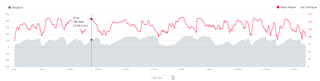
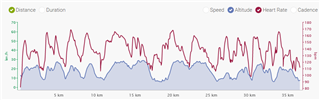
- The vertical axis is so small as to be useless.
- Having the graphs all displayed one underneath each other means by the time you can see all the information line graphs, the GPS trace is gone off the top of the screen so you can't see it any more.
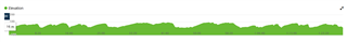
- Why on earth does the elevation graph start at -100m?? That's 100m below sea level. Funnily enough all of the cycling and running I do is above sea level. So any meaningful information is lost in the ripples on top of this.
- You GPS map zooms in and out on mouse roll = you can't naturally roll the webpage up and down with the mouse wheel because you get stuck in map zoom in/zoom out.
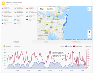
--->> Here is an example of a competitors graph that is really useful --->>
Everything is overlaid on each other. If it gets cluttered you can enable/disable HR/Elevation/Speed/Cadence by clicking on what you want displayed. See the little radio buttons at the top right of graph.
You can drag over a section of the line graphs and it will expand to that section only for the full width of graph so you can see a section in more detail.
Their GPS map is right above it and like yours the dot does move along where you are. Just on theirs you can see the GPS map because you haven't had to scroll down so far to see the all the information on graph after individual graph, that the map has long since disappeared off the top of the screen..
It would be wonderful if you could try and make the rest of the connect graphing useful in this way. My family has had garmins only for many generations of watch and love them, just have had to rely on 3rd party sites for functional training analysis and would love it if you could update this component. It would only lock people into your ecosystem more!
Thanks, Blysta
PS on a positive note, I like the heat color of the GPS trace on your map - that's really cool.