This discussion has been locked.
You can no longer post new replies to this discussion. If you have a question you can start a new discussion

Meaning of the "faster" and "slower" indication on the map of a completed run?

Hello,

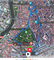
I have tried to find the answer online but wasn't successful: Can anyone tell me what it means when you look at a completed run on Garmin Connect and you first see where you ran with a colored line of various shades. Below the map it say "faster = red" and "slower = blue". My question is: Faster or slower than what?

It's driving me nuts :) Thanks for any info!

Camilla

Top Replies

All Replies

  • Slower / faster than the rest of the run. Meaning the blue is the slowest part of the run, while the red is the fastest one.

  • Thanks so much for this answer, I almost didn't see that tiny blue section where it's sort of more uphilly than the rest of the run -- so I can be "proud" of not running as slowly on even ground as on the uphill parts -- I had hoped I had been running "faster than before" but okay Slight smile

  • I have same doubt. Sometimes I run at 5:10 min/km and line is mostly blue, and sometimes at 5:20 and line is mostly green, so I am very confused!!!!

  • Why confused? The prinicple is always the same - the blue is the slowest part of the run, the red the fastest one. Just sometimes you start a bit slower or faster than the other time (or slow down during the run more than usually), hence the slowest (blue) pace is different and the rest is then shifted too. There is no absolute scale, it is always relative to the min/max pace of the concerned Activity.

  • I thought the RED/BLUE indicator was displaying the sections that were either faster or slower than the overall Average for the whole activity , is that incorrect??

  • I thought the RED/BLUE indicator was displaying the sections that were either faster or slower than the overall Average for the whole activity , is that incorrect??

    Technically yes, because the blue marks the slowest part, hence necessarily it is slower than the average. And oppositely red marks the fastest section, hence faster than the average. Just you cannot tell (without looking it up) what color the exact average has - it can be anywhere from magenta to orange (or perhaps even wider), because the average is not necessarily in the middle of the max and the min value.

  •  if what you're saying is true, does it mean that even if I enable my activity while hiking/running, and switch it off before I stop, there would still be part of track with blue even if it was almost as fast as the rest of the activity?

    I have one walk with all blue for example:

  •  if what you're saying is true, does it mean that even if I enable my activity while hiking/running, and switch it off before I stop, there would still be part of track with blue even if it was almost as fast as the rest of the activity?

    Yes, the colors are always relative to the recorded data. Any absolute scale would be difficult to make, or it would not help getting any valuable information, since the scale would have to be very wide to fit all possible cases.

    In your example there is probably some very short peak of the pace (most likely due to GPS repositioning), that is so short, that it is not visble on the map, unless you zoom it very closely. If it is at the beginning of the activity (GPS not perfectly locked yet), you can trim the start, and the colors should adjust.

  • I just chatted with Garmin support and they basically told me its not comparing to the average.  Its comparing to the "Spectrum" which outlier values can throw off the map overlay.  I had a ride the other day where I averaged 16.7mph but had a max of 38.5mph.  Almost the whole ride was blue except one red section compared to almost the identical ride without the same max speed outlier showing the whole range of colors.  Garmin provided me with a case number that they said others can request to join and hopefully we can get them to adjust the speed overlay to reflect comparing it to the average speed which is the method that makes most sense.   The case number is PSC-150027. 


  • Hey there, thanks for this cool answer Karchner14... If I understand correctly: the blue means in any given run/ride on this map view something like "hello, you were super much slower than usual here" and, respectively, the red means "you were super much faster than normal here"??? Because you're describing your "blue occurrence" much like my "red occurrence" was the other day after a run I do regularly and I thought I had improved on the whole (after switching from another wearable, so I didn't have the real comparison also because the other wearable was defective and therefore replaced by this Garmin) :D -- cool! Thanks!