This discussion has been locked.
You can no longer post new replies to this discussion. If you have a question you can start a new discussion

New track colouring - faster / slower - compared to what?

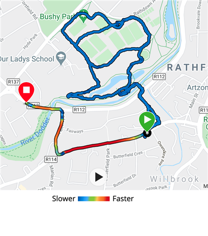
What is compared to what to get whether its slower or faster?

  • No, you cannot. Anyway, the center is green-yellow, but that's also not the average pace. It is just the center between min and max

  • And that is why it is useless functionality. Either colors should reflects real min/max/average or colors/legend should be for absolute values and not relative less/more.

  • And that is why it is useless functionality.

    Useless for you, usefull for others, myself including. Personally, I absolutely do not care about my average pace, since it is a number influenced by factors like warm-up, cool-down, intervals, road crossings, terrain, etc. Hence it is a number mostly having no true meaning to me. I just need to see on the map where my pace peaks, and where it drops, and that's exactly what the map now does.

    If I really wanted to see what color corresponds to the average (or more usefully - to my target pace), I would simply point the cursor over the pace graph, where it crosses the avg. line, and I'd see the corresponding color under the target point. 

  • I just need to see on the map where my pace peaks, and where it drops, and that's exactly what the map now does.

    Just simple use pace/speed graph in the same way as you suggested to me to see the average speed :)

    To see where pace/speed drops/rises you do not need 6 colors... Also you do not know exactly which pace/speed under each color because the legend is relative. Legend with absolute values will be more useful for both of us. But instead of that you are happy with current implementation, but suggesting to me use the old and not convenient method of what I need.

  • To see where pace/speed drops/rises you do not need 6 colors

    I do. With more colors I see where I am at the max pace, at the lowest pace, as well as where the speed drops less than to the min pace.. In other words, with a single glance, I instantly see where I am fast, and where I slow down, and that what I need to see. And as the page shows what my max and min pace are, I have a pretty good idea what each color represents. If not, it is easy to check it out in the way I described.

    suggesting to me use the old and not convenient method of what I need.

    You misunderstood. In the old method you did not see your speed progression on the map, so if you wanted to know it, you had to compare all the track with the pace graph. Now, all you need (if you cannot guess it), is just looking up the color of a single point for the reference pace, and that's all.

    If you want that Garmin adds the exact min and max values to the legend (and/or whatver else values), just send them the request through the form at www.garmin.com/.../