This discussion has been locked.
You can no longer post new replies to this discussion. If you have a question you can start a new discussion

Lack of useability and reporting in Garmin Connect

Former Member
Former Member

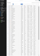
Is there a different Garmin Connect Interface besides the one that shows almost nothing on the Activities page?  The old interface showed something akin to an excel sheet with many lines of data all at once. The new one, at least on a Mac, shows 5 lines.  It's all sexed up but not useful.  Is there any way to view the old interface?  Also, you used to be able to run a report where you chose the fields and the date range and it was awesome. The new report page is very restricted and does not deliver the detail data - just a graph.  It's so frustrating. 

When I download data to a csv file I get 21 lines - that's it.  

Top Replies

All Replies

  • I am not quite sure I understand what you are referring to. The interface of Garmin Connect Web did not considerably change since several years, AFAIK (except of some minor details up and then). And it is the same regardless whether you use a Mac or a PC. Well, perhaps I do not use Garmin Connect long enough. How many years old interface do you reffer to, when speaking about the "old interface"?

  • Former Member
    0 Former Member over 5 years ago in reply to trux

    They made the update a long time ago (several years) but for a long time you could use the 'classic' interface.  Notice how the URL has 'Modern' in it (https://connect.garmin.com/modern/)  That's the issue.  the 'modern' interface is terrible.  They updated it about 5 years ago or so.

  • And what exactly are you missing now? It is not quite clear from your opening post. You speak about the new interface being sexed up vs. the old one, and that the old one had excel-like sheet, but it is not quite clear what information you are looking for, and what data are you missing now. If you could be a bit more specific, perhaps we could help you - there may be some possibilities.

  • Former Member
    0 Former Member over 5 years ago in reply to trux

    As I said at the beginning of my post, I'd like to see a lot more data on the screen.  5 activities isn't doing it for me.  I used to be able to see many more than that at a glance.  I don't need 2 lines of information in giant font and a graphic.  I just need 1 column that says, run or bike or swim or whatever.  Also, I would like to download data in bulk (like a whole year's worth) and I can't see how to do that.  As for the columns, date, type, duration, pace/speed, location - the same stuff you show now is fine.  I just want a lot more of it at once.

    Thank you!

  • I don't het it either. My activity view connect.garmin.com/.../activities is infinite, I can keep scrolling to get to 1.1.2019 and after I hit "Export to CSV" I have all information I need in a spreadsheet (~500 lines and columns from A to AN).

    And reports? Well, I have a Garmin device for 8 years and never used these reports. Strava with Elevate can give you much better output. Just I really don't understand why we in GC don't have a proper training platform similar to Elevate or TrainingPeaks... could be available for a small monthly fee... Really, with all the money they have can do more...

  • Former Member
    0 Former Member over 5 years ago in reply to randybb

    My activities go back to 2005 and I'd like to see them in chunks of 15-20, not 5.  If you've never seen that then you are correct - you don't know what I'm talking about. That's the way it used to be, though. When I click 'export to CSV' I get 41 lines so by all means please tell me what you do to get your infinite data.

    As for the reports, of course you don't use them in garmin connect. They are not useful. But they used to be! They used to be great!

     If you have some useful information as to how I can get more information I'd love to hear it. I have Strava and Map my ride and Ride with GPS and who knows what all but that's not what I'm writing about.  What I'm writing about is the fancy but not very useful interface in Garmin Connect.  It used to be way better. 

  • Could you post a screenshot of the screen you are seeing and speaking about? What you describe somehow does not match anything I know about Garmin Connect, so I 'd like to know what exactly you are referring to. As  wrote, I can see thousands of activites at a time on the same page if I wish to. and sort them, and filter them in any way I wish. And I have hundreds of different Reports available on the Reports page as well. So I  really still do not understand what exactly you miss. Hence, if you posted the screenshot, we coudl perhaps identify the problem, and advise you a better way to look at the data.

  • Former Member
    0 Former Member over 5 years ago in reply to trux

    this is what I see when I click on 'activities' on the left. Is this not what you see?  And yes - I am slow as a turtle right now but trying to regain my former fitness which is why I want data.

  • It looks like you have a really small screen - I guess just a phone or a device where you have set a very huge font size. Anyway, if tou scroll down, more lines will be loaded infinitely, as long as you continue scrolling down. And if you adjust the font size, then many more lines will fit onto the screen. On a PC, you can simply hold the Ctrl key and use the mouse wheel to adjust the font size to your liking.

  • This is a screenshot of my activities, when adjusted to my needs: