I setup a running workout with 1 minute on, 1 minute off. For the 1 minute on, I set a target heart rate zone.
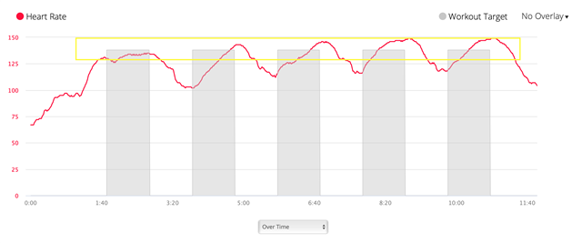
I did the work out this morning and everything worked as expect. However, reviewing the workout on Connect website, the heart rate graph isn't great (below).
The grey boxes are the targets, but they just seem to go from 0bpm to halfway into the desired zone. It's hard to read because I can't actually see whether I am inside or outside the desired zone.
I added the yellow box which roughly represents the actual zone.
Is there a better way to view this or overlay the actual zone on the graph?
Thanks


