
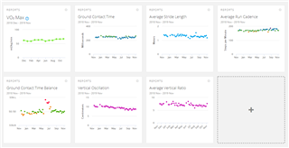
Hi,
can you provide feature to rescaling reports chart on dashboard? this could improve their readability. Currently on graph there are big range of Y axis which are not used, but limit readability in more useful data range.
Hi,
can you provide feature to rescaling reports chart on dashboard? this could improve their readability. Currently on graph there are big range of Y axis which are not used, but limit readability in more useful data range.