This discussion has been locked.
You can no longer post new replies to this discussion. If you have a question you can start a new discussion

I hate cycling

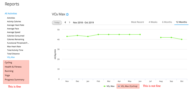
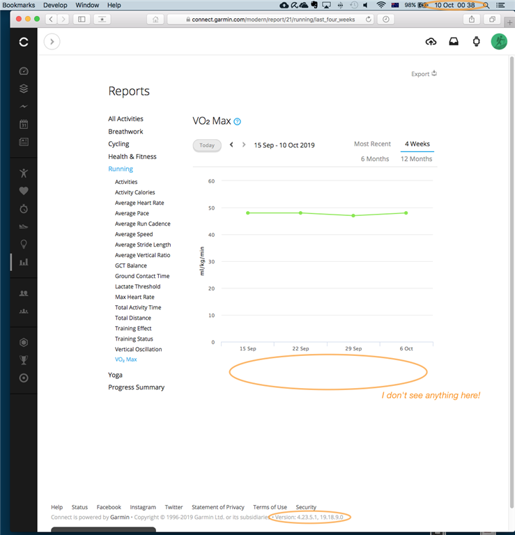
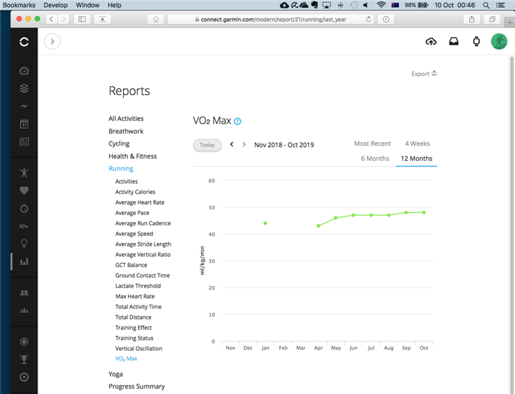
Why does Garmin Connect continue to propose me statistics on cycling if I never used my gear on a bicycle in all my life? How do I get rid of these screens? E.g. in the VO2 max there are two sources, running and cycling, as if every Garmin user has to do both.

  • It's not as if you'd accidentally bring up the Cycling VO2max report page by accident; you'd have to either expand the selection of reports under the heading of Cycling, or have a widget set up to display it on your dashboard, to get to that report with a click (or tap).

    There is no doctrine that says all software ought to be customisable to suit each individual user to the last detail, so that they don't need to see what they find irrelevant or irritating. It's not a bad thing to be reminded of what one isn't doing (but could be doing), especially if the user is proud to choose not to do it with eyes wide open.

  • Dear ASmuDill

    thanks for your reply. I am not complaining about something that happens to be on the page and it is of no interest to me. I am highlighting an inconsistency in the dashboard. The graph displays in information of axis that do not exist (cycling) there is no blue line in the chart. 

  • Yes, that is exactly the problem. Garmin connect brings up inexistent stats for cycling. The version is not your or my version. This is the version on Garmin servers, nothing to do with the machine connecting to the site. 

  • The screenshots showed what I saw in my browser just now, so it's the current version of Garmin Connect Web application, and neither Garmin Connect Mobile (on Android or iOS) nor Garmin Express (on OS X or Windows 10).