
Basically, the summary plots of things such as pace and (especailly) cadence should either 1) have scalable y-axis (such that you can zoom in to a certain spm or pace), or 2) ignore outliers that often occur when you stop for a second.
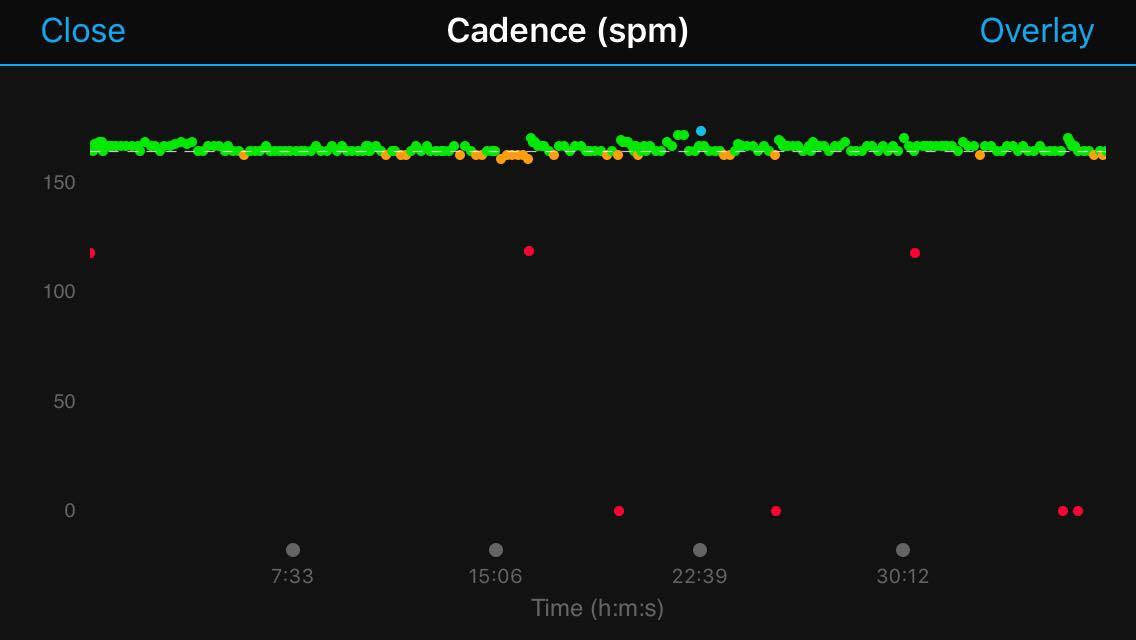
I'm attaching photos of the cadence graph from two different runs. The second one is how most of my runs look: there's a thin line where 95% of the values are between 160 and 175, and 5% of the values are less than 100 (often zero). These low cadences happen when I stopped at a stoplight or similar situations. As a result, its almost impossible to see any trends within the 160-175 band because the scale is too large. Even if I zoom in on a section where there are no <100 values, the y-axis scale still goes from 0-200 limiting the vertical variability that I can see.
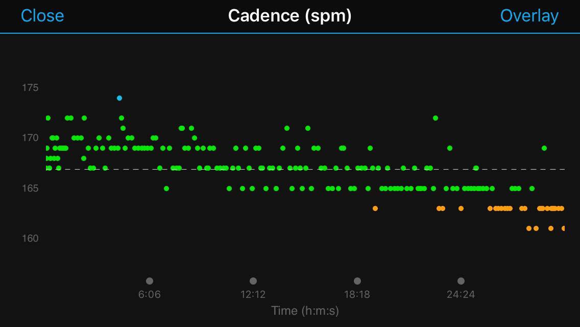
In the first photo, I made sure that I started the watch while already running and never stopped. As a result, the y-axis goes from 160-175 as all values are within this range. This allows me to see trends much better such as that (in this example) the cadence dropped over the course of the run.
Either I should be able to zoom in on the 160-175 section of the graphs, or the graphs themselves should preprocess remove the outliers that are less than 100 and occur for only 1 second. ciq.forums.garmin.com/.../1440395.jpg ciq.forums.garmin.com/.../1440396.jpg