
Hi Everyone,
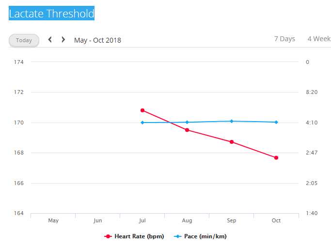
Lactate Threshold graph in Report section is hard to understand becauseheart rate has the correct interval of values in vertical axis instead the pace has a very wide interval of values in the vertical axis.
The result is a readable heart rate graph but a very flat pace graph, this isn't to much usefull.
Could be nice to have tight pace interval of values in the vertical axis.
Thanks
Daniele ciq.forums.garmin.com/.../1419006.png