This discussion has been locked.
You can no longer post new replies to this discussion. If you have a question you can start a new discussion

Run pace graph in GC (web) is zoomed out too far when activity contains rest periods

The pace graph for run activities in GC (web) and GCM are both scaled according to your min and max paces during an activity. There is no "true" minimum pace (expressed in minutes:seconds per km) that can correspond to "not moving" (except for infinity seconds per km), so obviously the software has to pick an arbitrary minimum. The problem is that if this minimum is too low (slow), the scale of the graph is zoomed out to the point of uselessness.

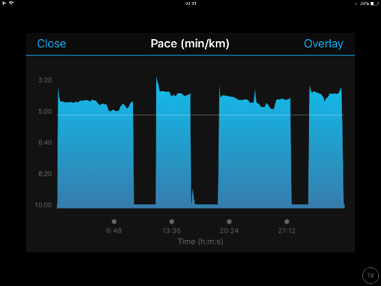
GC (web) uses 40:00-50:00/k as the minimum pace, which produces useless pace graphs when you have significant periods of not moving (such as interval workouts with stationary rest). The scale of the graph is zoomed out so far that that 3:30/k and 4:00/k are barely distinguishable.

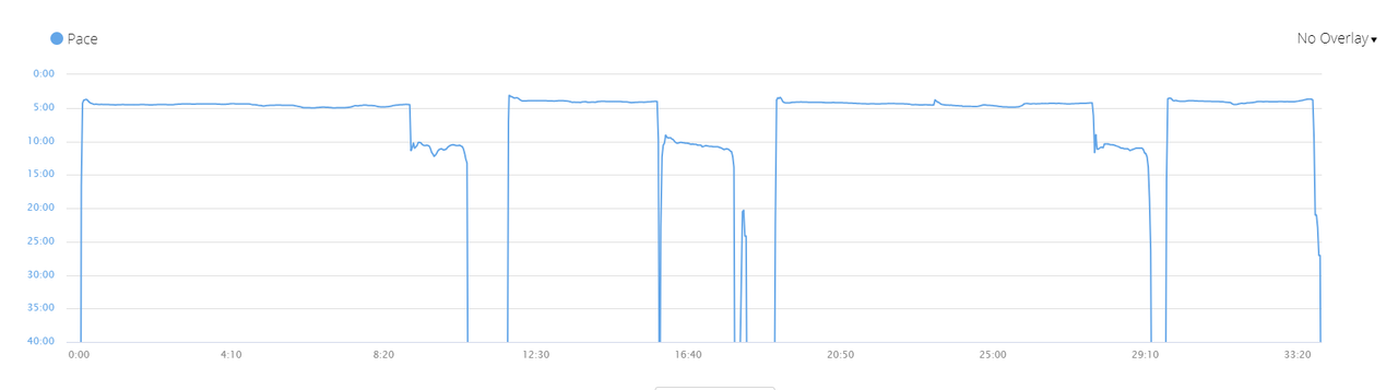
GCM seems to uses a more reasonable minimum of 10:00/k in similar cases. For comparison, Strava also seems to bottom out around 11:40/k, and I've never had a problem with the graphs on that platform.

It would be great if GC (web) used the same minimum pace as GCM, so graphs would look the same and be useful on both platforms. It would be even better if you could zoom in vertically, effectively choosing your own minimum, to take a closer look at how your pace changed in the range you actually care about. (For example, in an interval workout, I care about when I was going 3:30-4:30/k, not when I was standing still at "40:00/k", and maybe not even when I was jog recovering at 5:30/k)

Example pace graph for interval run on GCM. The graph looks fine and shows me the general trend of my pace (which tells me that I tend to go out wayyyy too fast.)
https://i.postimg.cc/65Fc3t4L/File_001a.png

Same interval run on GC (web). The graph is useless except to see where I was recovering. (You may want to click to zoom and see it at full size).
https://i.postimg.cc/gjQVnHjk/gc-web.png

(I would love to have posted these images inline, but the forum isn't cooperating).
  • I understand it is annoying and I don't think there is any solution to it. I don't think the systems are really designed to be operational during rest periods, I suppose they are assuming that you would hit "pause" during the resting period instead?
  • Martin Thanks for the response. I was beginning to think that nobody else noticed this problem.

    I don't think the systems are really designed to be operational during rest periods, I suppose they are assuming that you would hit "pause" during the resting period instead?


    Maybe, for manual workouts. I used to do that in the beginning, but I changed my "workflow" when I realized I wanted to see HR stats during my rest periods and also to be able to look back and see the exact workout, including length of rest periods. To me it seems that people who press pause during rest periods either don't care about their rest stats or want to make their activity look faster on Strava.

    But for automatic programmed workouts, both rest periods and active periods are represented as laps (or workout steps), and the device is not paused during the rest periods. If you pause the device during a rest period, then the workout will never complete. So obviously it's a valid use case to be standing around or moving very slowly during a recorded activity.

    Also if you are running a race, I would argue that it's never valid for you to press pause in the middle of the race, even if you have to stop to drink water or take a Porta-Potty break.

    So as far as I can tell, if you do a programmed interval workout on a Garmin, then the Garmin Connect pace graph will be useless. Sure, you can hover over it and read the values, but the actual graph will not be worth looking at.

    Like I pointed out, other platforms such as Strava set a more reasonable minimum around 10:00-15:00/k. Even Garmin Connect Mobile uses a reasonable min of 10:00/k. Runalyze goes further and seems to have a logarithmic (or otherwise non-linear) pace chart, which works really well to show pace changes in the narrow range that runners move, as well as showing periods of rest or walking.

    Furthermore, both Garmin and Strava have the concept of "moving time/pace" and Garmin has auto-pause, which means they have some arbitrary pace threshold for when you are not moving (since with GPS errors/etc., it's unlikely your speed will ever be exactly 0). Strava happens to use a 30-minute mile pace, which seems very reasonable to me. 30:00/mile works out to 18:38/km, which would be fine with me, if they made the graph taller. I think 40:00/k is excessive.

    Every linear pace chart has to have some arbitrary minimum. If I'm not moving at all, my pace is Infinity seconds per k, or at least a very large number and it won't fit on the graph. The question is really just what minimum to choose.
  • ANy change Garmin improves this? Otherwise its just a useless utilization of screen space. And very annoying.

    Pausing activity while training is a painful option and prone to errors (ie forget to turn it one, plus it can be useful to register the decrease in hear rate during periods, etc.

    The horizontal scale can be changed but the vertical no, a pity and something that should be easy to correct.