You can no longer post new replies to this discussion. If you have a question you can start a new discussion
Resting heart rate plot
Former Member
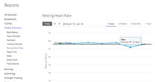
The current multi-day resting heart rate plot doesn't work very well because it also shows max heart rate and the y axis isn't zoomable. This means that the resting heart rate will always just appear like a flat line. In order to work out trends in resting heart rate, either it should be on a separate plot with an appropriate y axis scale or the y axis should be zoomable.
I agree with this. I hope this can be improved for the Android app.
Since the graphs (max HR and resting HR) are plot together in the same scale, Resting HR is always flat. We also can't hover to show the values of data points, which means that the Resting HR is pretty useless.
Please let us see the graphs independently (or show/hide on of them).
Since the graphs (max HR and resting HR) are plot together in the same scale, Resting HR is always flat. We also can't hover to show the values of data points, which means that the Resting HR is pretty useless.
I do not know what report you are looking at, but I do have an independent graph just for the RHR, and can also hover over the individual points to see the details. It is at [ Reports » Health & Fitmess » Resting Heart Rate ]
In that case you are asking on the wrong forum This one is for the web interface. However, Reports are available only on the web version, so I am afraid you'll have to use that.