You can no longer post new replies to this discussion. If you have a question you can start a new discussion
Timeline of an activity not evenly distributed?
Former Member
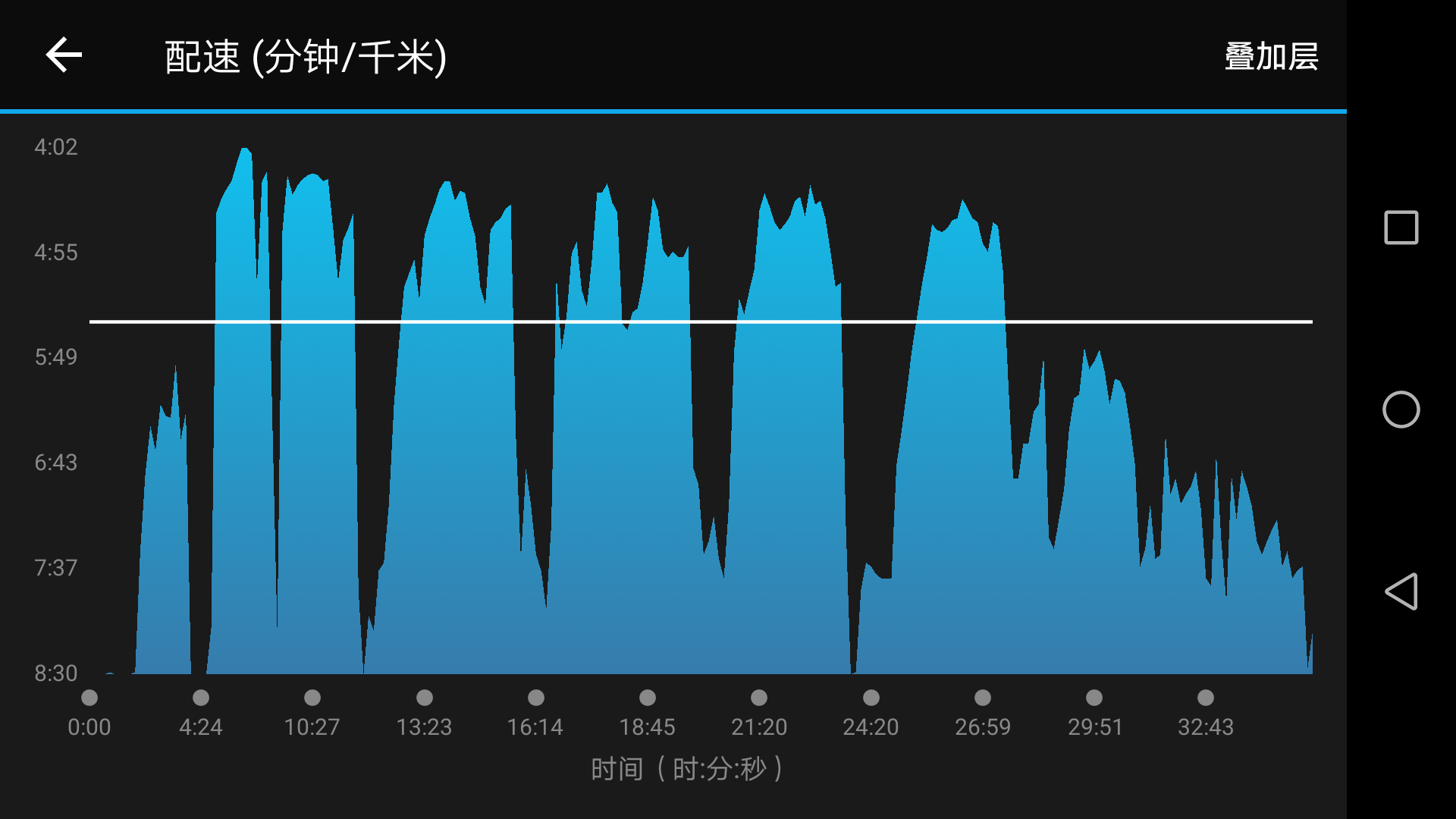
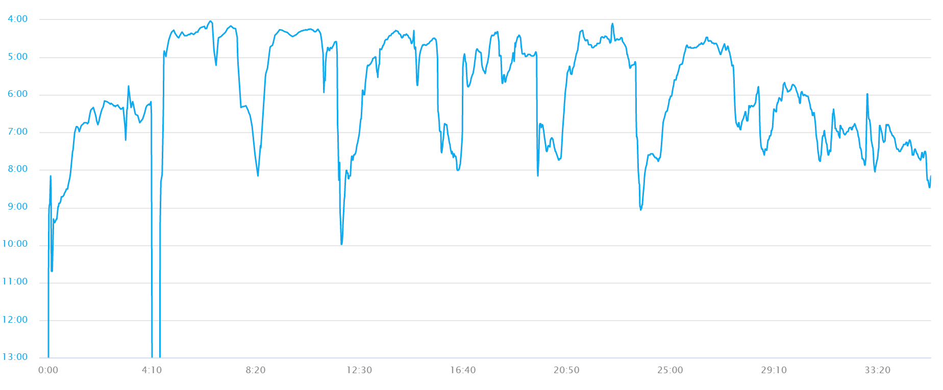
See attached pictures. They are the pace-time figure for the same interval run (6*[3min + 1 min recovery]) . Clearly, the one on the website is evenly distributed while the mobile app seems compressed the first 10 min. Why is that and is there any way to fix it? ciq.forums.garmin.com/.../1297969.pngciq.forums.garmin.com/.../1297970.png
the vertical axis is pace, which is not related to my question. My question is what happened to x-axis. The x-axis is time as show in the two figure. The distance in the mobile app, however, represent different time with the same distance. For example, from beginning to first dot is 4:24, while from first dot to the second is 6:03.


