You can no longer post new replies to this discussion. If you have a question you can start a new discussion
Course view on Garmin Connect
Former Member
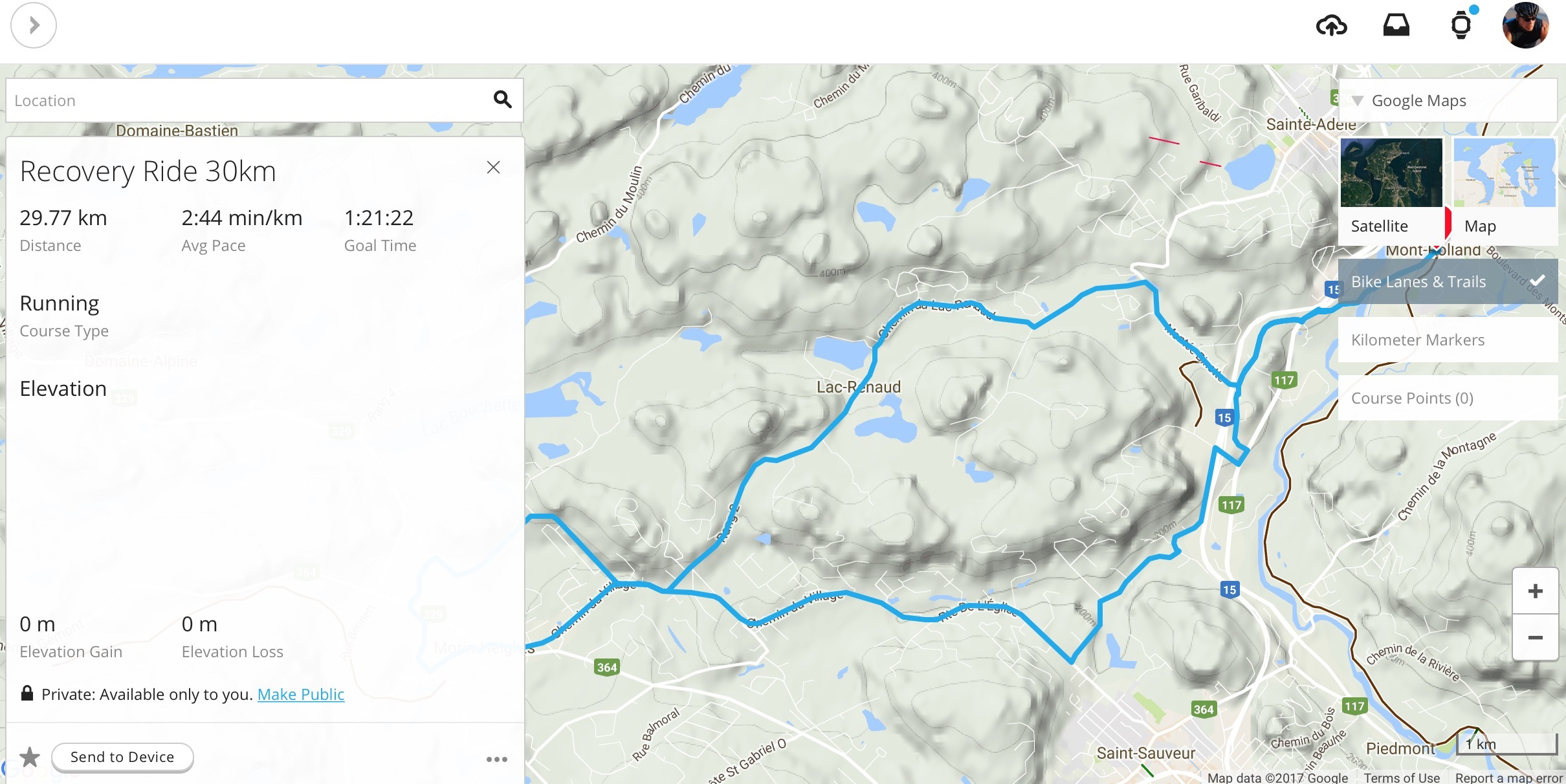
So they've changed how Garmin Connect displays courses - You get this stupid frame that displays nothing but a message that tells you it is displaying nothing of i.e. 0 of 19 courses. So you click "show everything" and you get a list of courses in a similar frame - you select one and it display the basic information in the same frame with the map in the background....with much (a solid third) of the map hidden behind this box you cannot remove. If you click the "X" on the box, the whole course is gone. It's the MAP I want to look at, not the stats. Who does useability on this web site anyway? Is there ANY useability testing done at all? See attached pic of the new idiocy. ciq.forums.garmin.com/.../1252254.jpg
I agree with initial comment, the massive box on the left is in the way when trying to plan or edit a course (route), but it can be hidden when viewing an existing one. Not very user friendly for sure and would be much better if all data screens on one side and/or custom-able.
There was never anything that needed to be fixed in the Courses section. It is now a disaster:
1. Too many pop up boxes everywhere on the display, obscuring the whole point of Courses - THE MAP
2. I'm using Safari 11.0 on Mac OS 10.12 and the map will not zoom in to the previous level of detail. Trying to create a course in satellite view is nearly impossible due to the lack of detail.
3. In satellite view, the street names have completely disappeared. Not good when trying to map a detailed course that doesn't lend itself to the stick figure appearance in street view.


