I love Garmin and the Connect platform, but it's too much hassle to get a proper overview and the UI lacks presentation and feels more like a spreadsheet than an app.
Connect requires a lot of taps and swipes to reach the data you want to look at.
I've come up with some ideas and created some sketches on how to easily improve certain parts of Connect app.
It's uses Apple's Liquid Glass to be modern, standardisering and smoothie. I based my ideas on the latest version of the dashboard/Home page.
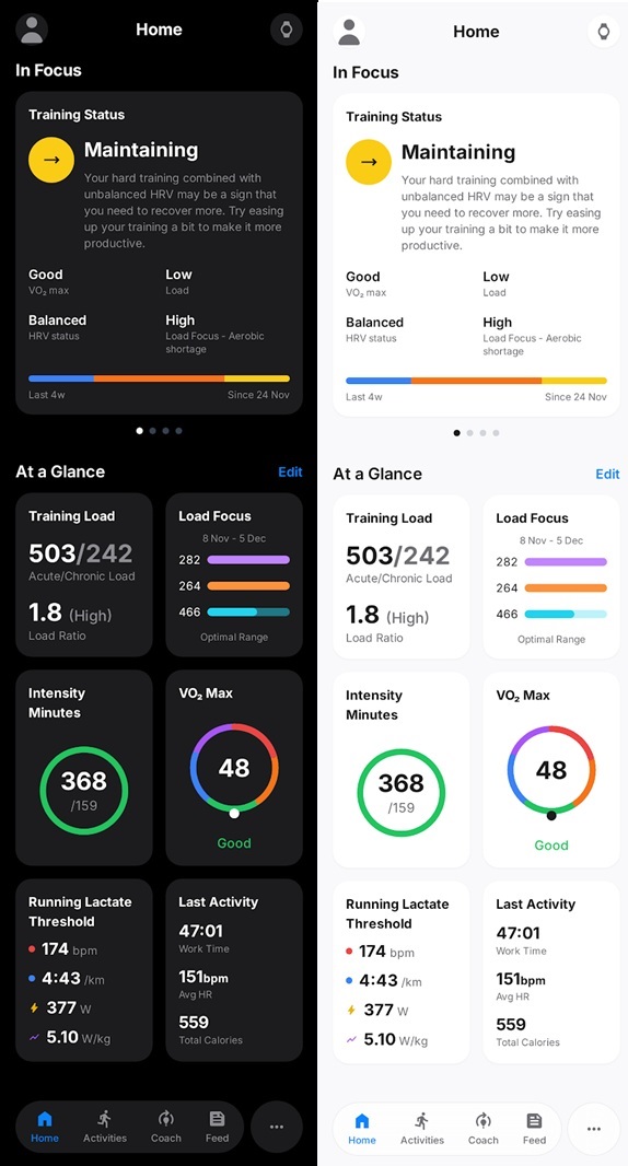
Dashboard
Keeping more or less as it is. Showing text for Trainng Status above the other metrics that is now shown in a grid.
I would like to see progression based on goals and precision data; AI coach here, but haven’t sketched it.
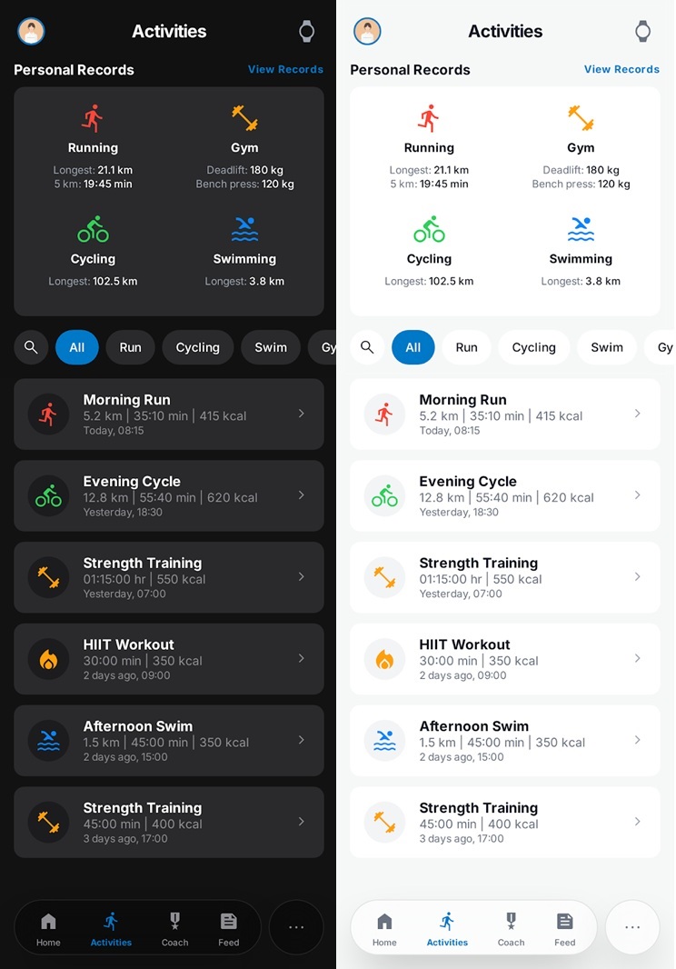
ACTIVITIES
Instead of a list with categories listing historic activities, with the ability to search and filter (by activity type).
Showing beige records at the top.
ACTIVITY - OVERVIEW
Cleaner UI by adjusting spacing, margins and moving some itemd into the popup meny. Using some other font sizes, headers and using of grid for data.
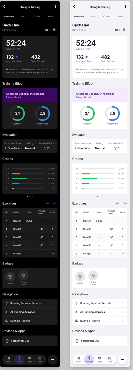
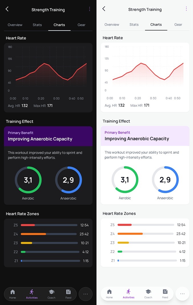
ACTIVITY - CHARTS
Redesigned charts to look clean and modern.
Headers with grouped data for a better overview and cleaner look.
Training Status popping with colors, benefits and explaination to miminize clicks and be more useful.
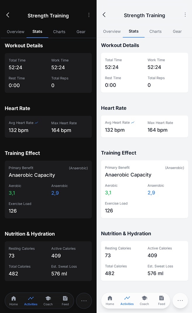
ACTIVITY - STATS
Using greater font sizes to mimimize the feeling of looking at a spreadsheet.
Grouping data under headers and using grids.
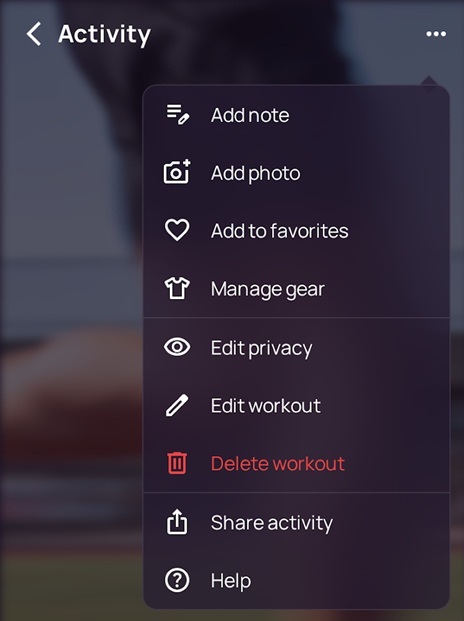
Activity popup menu
Reordered popup menu and added items to keep the UI clean and free from excessive data