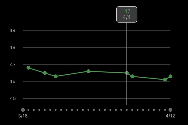
After one of the updates several months ago, Garmin Connect iOS is showing the timeline for VO2 Max in a funny and unhelpful way: instead of the points showing the actual VO2 Max of previous activities they appear offset randomly (see screenshot). Anyone else see this?
I'm not sure what this is supposed to indicate, a moving average or something else? Is VO2 Max now calculated as a fraction of a whole number under the hood? It would be much appreciated if the timeline is fixed to show the actual VO2 Max as before.