I have used Garmin Fenix for years - at first Fenix 3 and then Fenix 6 Pro.
I'm not a keen athlete, but I exercise about 5-6 hours a week.
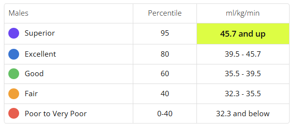
Garmin has always given me a VO2 value of around 34. I haven't paid any more attention to this - other than that the result is poor according to Garmin's table.
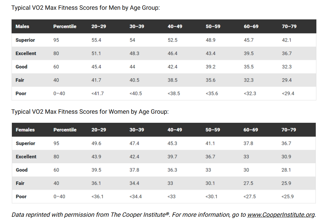
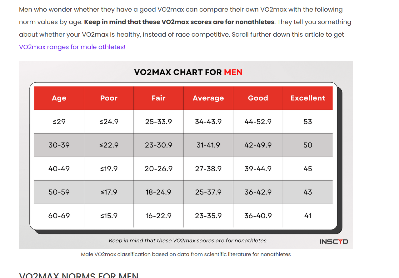
Quite by chance, I came across a VO2 chart for a person my age (male, 55). It had a completely different definition. 34 was above average - while Garmin said it was the second weakest possible.
Can anyone tell me - does Garmin measure different VO2 max value or does Garmin not know how to relate the VO2 result to the person's age or what is the issue?