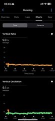
I’m using a Forerunner 265, and I’ve noticed that the Y-axis scale on charts in the Garmin Connect iOS app often doesn’t make sense — especially for VO, VO ratio, and temperature.
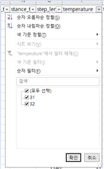
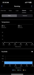
For example, in one activity, the temperature data was only 31–32°C (confirmed by parsing the FIT file — no missing values), but the chart still showed a Y-axis going up to 60°C. It makes the graph look flat and kind of useless.
I've tried re-installing app and re-pairing watch, but the chart stays same.
Anyone else seeing this?