This discussion has been locked.
You can no longer post new replies to this discussion. If you have a question you can start a new discussion

Design of heartrate infomation

Hi team Garmin,

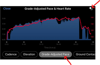
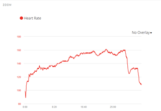
I am really enjoying the watch but I have a annoyance in reading back my training. This comes from the heart rate graph. Because the graph is filled from the bottom it looks like 1 big block and it’s hard to see the course. I would really love if this becomes just a single line like on the watch. 

Additionally on the watch you also see a colour change in the line to see what zone you trained in. If that would be possible to also have in the app I would be very happy.

Have a nice day and hopefully I get a nice Christmas present from you by either 1 or 2 changes

Top Replies

All Replies

  • I am really enjoying the watch

    You are in a user-user forum here. If you have problems, you should contact Garmin Product Support.
    You should let them know which watch it is. There are many different ones.

  • I would really love if this becomes just a single line like on the watch. 

    As bluefish wrote, this is a user forum, so we cannot change how the app works, but sometimes we can offer you alternative solutions. In this case you are lucky, because there is indeed one: open the HR chart in the full-screen mode (by tapping on it and turning the phone into the landscape position), select an overlay by tapping one of the buttons under the chart, and then tap the small icon at the top right - it inverts the overlays, and voilà ... here you go, the HR chart becomes a single line, exactly as you wished (see the red line in the screenshot below):

    Additionally on the watch you also see a colour change in the line to see what zone you trained in. If that would be possible to also have in the app I would be very happy.

    I recommend suggesting it to Garmin at Share Ideas | Garmin, but TBH I do not believe it has a lot of chance to be implemented anytime soon, since I am afraid the charts are built using a 3rd party library (different than on the watch), which may not easily allow a simple implementation of such feature. So it may require some serious coding, or a change of the architecture of the app.

  • ... and another, even simpler, solution for the HR graph as a single line, is using Garmin Connect Web - if you open the full screen HR graph, it pops up as a single line. You do not even need to use any overlays and inverting, like with the phone app:

  • You’re right Im at the wrong place. Some companies have developers in their forums but  Trux send how garmin does it. Thanks for your replies