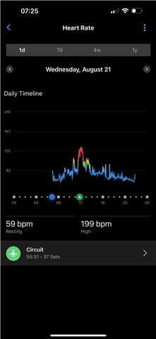
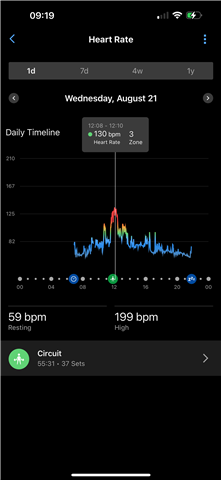
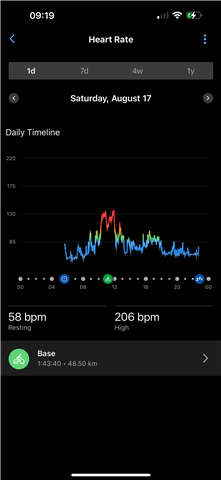
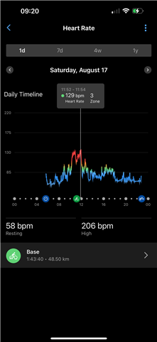
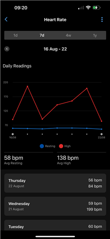
Don’t know why but the heart rate graph in Connect on both iOS & Web has started to give a totally fictitious max heart rate which isn’t correctly shown in the day graph! But it does in the 7 day graph. Also the graph line colour shows red (zone 5) which it isn’t! But put your finger on it the marker shows the correct HR and zone!
The graph line is shown correctly on my Epix Pro. It’s Connect that’s the problem!
Anyone else?