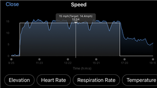
Gets in the way of the point where I wan't to select.
iPad IOS 17.5.1
Garmin App: 5.4.0.23
That's true, but the box disappears in the moment you remove the finger from the screen. And you can also reposition it to the sides as you need, for example if you search the min or max value. And you can also zoom in using two fingers, and then it may be easier to select exactly the point you want.
the box disappears in the moment you remove the finger from the screen.
Beats the purpose of wanting to see the data on a specific part of the graph. For example, I use it to calculate start and end times of an effort. Although the time is still viewed it makes it almost like one would have to guess where the finger is selecting.
you can also zoom in using two fingers, and then it may be easier to select exactly the point you want.
This without a doubt helps, but the box still appears locked in the same position to which the graph adapts and makes it show no difference. Less guesswork but fewer distance you can go to unless you zoom back out.
... Found the problem. The box's opacity has been raised completely. This is a view from how it was before.
