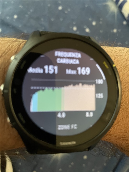
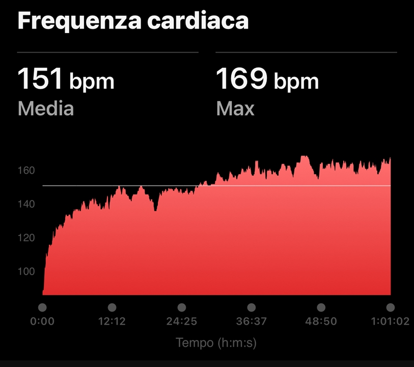
I will never understand why the app uses such a "sparse" graph for heart rate, instead of trivially using the same graphical pattern as the watch (varying colors based on fc zone)

This graphic is another thing.
it shows how many times you run in any zone.
i want see WHEN I run in any zone
As the OP said - I also want to see at what time in the run I ran in which zone, I agree that the time in the zones is valuable but is is also valuable to know when you were in which zone during the run…
if they can do it on the watch so why not add it to the app
What exactly is this supposed to show ? What is interesting for me is how much time I have spent in the relevant zones. You can't tell that from the graph on the watch. It's nice that the graph on the watch is colorful, but I look at my exact statistics in the app. Even there, I wouldn't be able to see any precise information with a colored HR graph.
Displaying the time in zones is much more accurate.
yet another fail by Garmin.
I don't think so.
As the OP said - I also want to see at what time in the run I ran in which zone, I agree that the time in the zones is valuable but is is also valuable to know when you were in which zone during the run, and yes you can see it with the all red graph but it is not outright as it would be with the colours so why not add them? There is a lack of consistency throughout the platform. And I do think this is a fail by Garmin.
I suggest that you send an idea suggestion to Garmin. I do not miss it.
The data field on the watch shows me which zone I am in directly during the activity. That's the important thing.
It is irrelevant for the effect of the training to be able to see later WHEN you were in which zone. For the training it is important HOW MUCH time you spent in the respective zones.
I had just sent the idea many times ago…
In any case, all the other vendor use the colour of hr zone, if you have to run interval in z4 and recover in z2, how see this data?
sure, I see them during activity but I think it’s a good thing keep this historical data