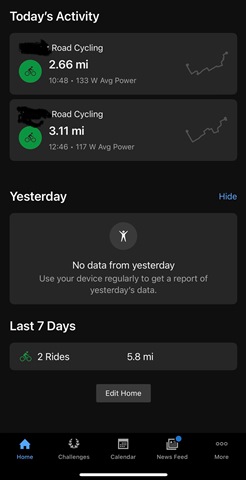
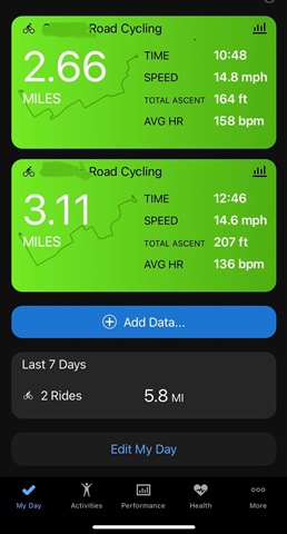
It’s terrible.
Can we please just have the option to go to the old version
Utterly awful. Used to be clean, on one page and easy to see. Now have to scroll to find things. Poor work Garmin
I agree that it is terrible, I was so at home with the previous format and now am all at sea. Please can it be changed or give users the option to revert back?
I too hate the new design... you do have the option to revert to the old version on Android. I did it this morning. And it's like a weight off my shoulders...
connect.en.uptodown.com/.../versions
1. Uninstall Connect from phone
2. From the above link I installed 4.73.4
3. Log back in, let connect grab all your details.
4. To prevent Garmin auto-updating to latest version again, in phone's settings go to:
Apps>Connect>Data Usage and turn off the following:
- Mobile Data
- WiFi
- Background Data
It has worked for me. Still syncing with my watch, but just not connecting online. I don't know what kind of implications this will have going forward. I.e. if you use weather info or download routes or workouts from within connect etc (I don't) then you may have issues.
Maybe when my watch needs to install latest firmware I'll have issues? Ridiculous that I need to do this anyway, but it's working for now.
So, two months later, what do we have?
- no improvement to the app or web
- no option to revert
- no statements from Garmin on why the *** and plans to fix (or did I miss it?)
I almost completely stopped using the app (once or twice a week vs several times a day), the app is slow and most of the time when I open it some of the tiles are empty. Initially I thought things will improve (Garmin would fix things and I find workarounds), but none of this happened, so I mentally downgrade Garmin and find myself avoiding using the app.
Hello Garmin? Are you out there? Are you listening? This is your forum. These are your customers. Hello?
Yes, I too have pretty much stopped using the app. Every time I do, I end up getting angry.
I can’t believe Garmin has not earn attempted to address any of these very dissatisfied customers. Sadly, it is telling how customers are viewed in their eyes.


in what world is the updated version (top) better then the previous version. The previous version just hides "Yesterday" if there is no activity. This new version just slaps some big empty card there to take up space. All the stats for my rides is on this one page in the previous version. Garmin has still yet to respond to anything. I'm moving on. Their lack of response is what does it for me. A simple "We are working on it" or "We understand your frustration and will make things right as fast as possible". Anything. Their silence is pathetic.